The Challenge
How might we encourage recycling correctly on campus?
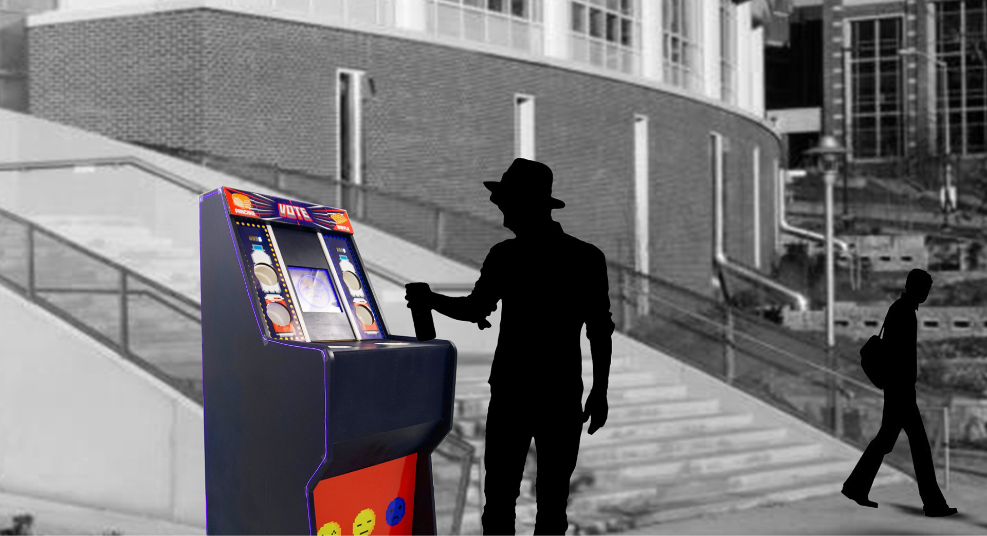
Embracing this challenge, we went through the human centered design process with a focus on elements of play to create an environmental experience. Through a user centered design and prototyping process, we created an arcade machine with a simple question with feedback. Users recycle their can or bottle and score bonus points for their vote by emptying their drinks in the funnel. With arcade themed audio and visual feedback, we created a delightful experience users would excitedly use to vote for their side.
Team: David Howard | Ruturaj Eksambekar | Zheru Jiang
Role: Experience and Physical Design, Physical Fabrication, Electronics Design and Fabrication, Programming, User Research
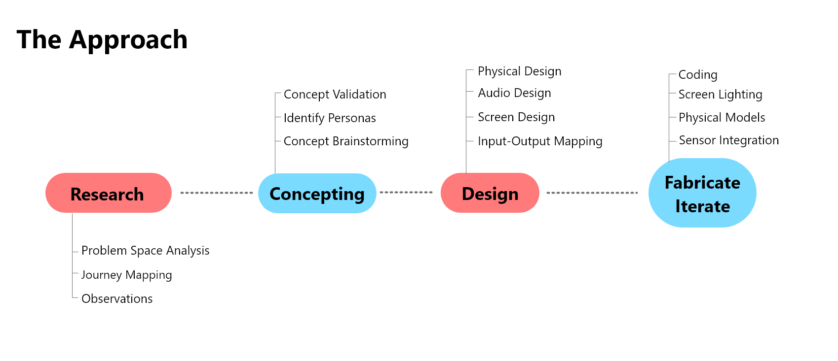
Research
Observations
We conducted an observation session around a heavily used area in the center of campus to begin identifying the current users and product space.
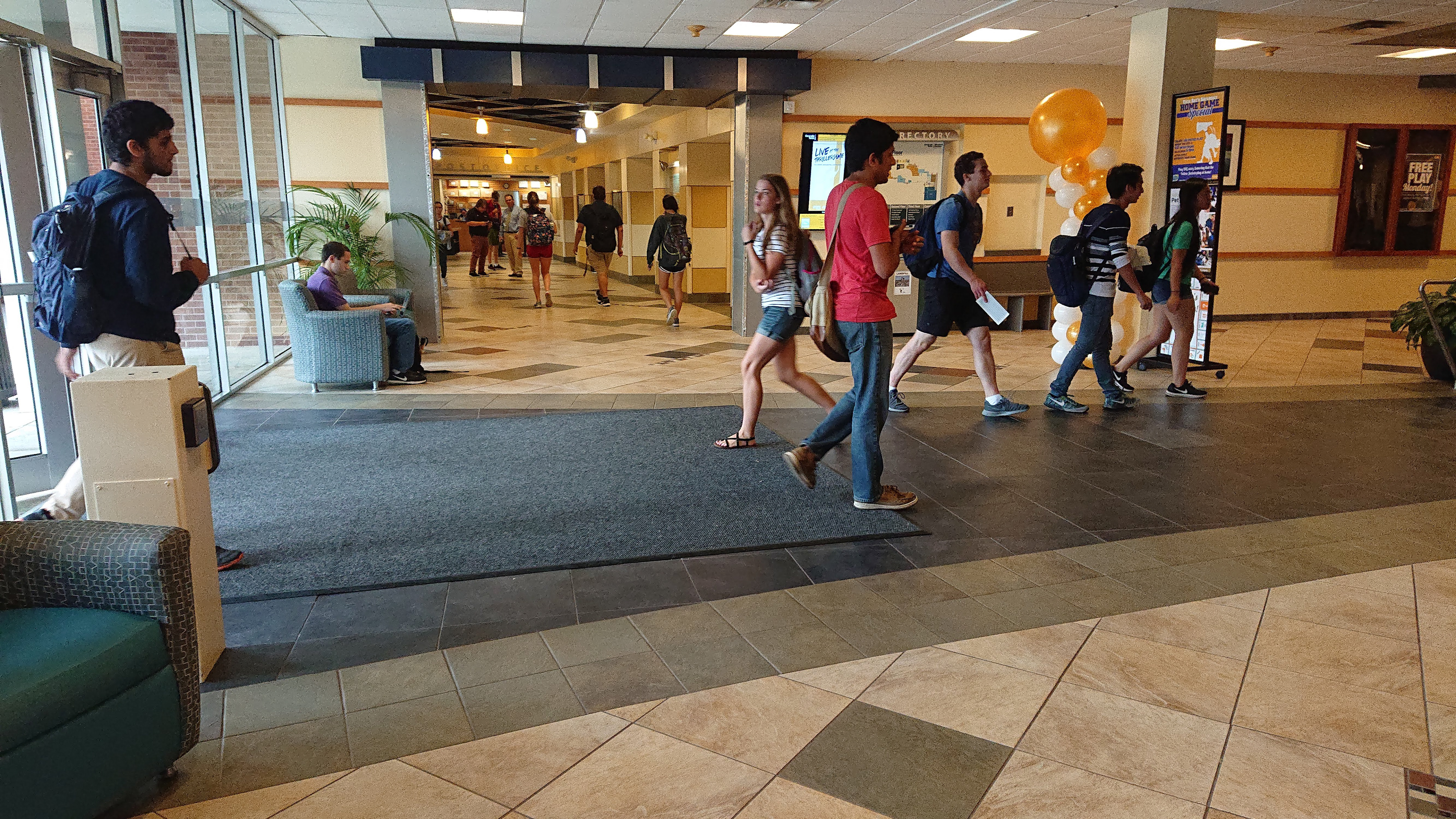
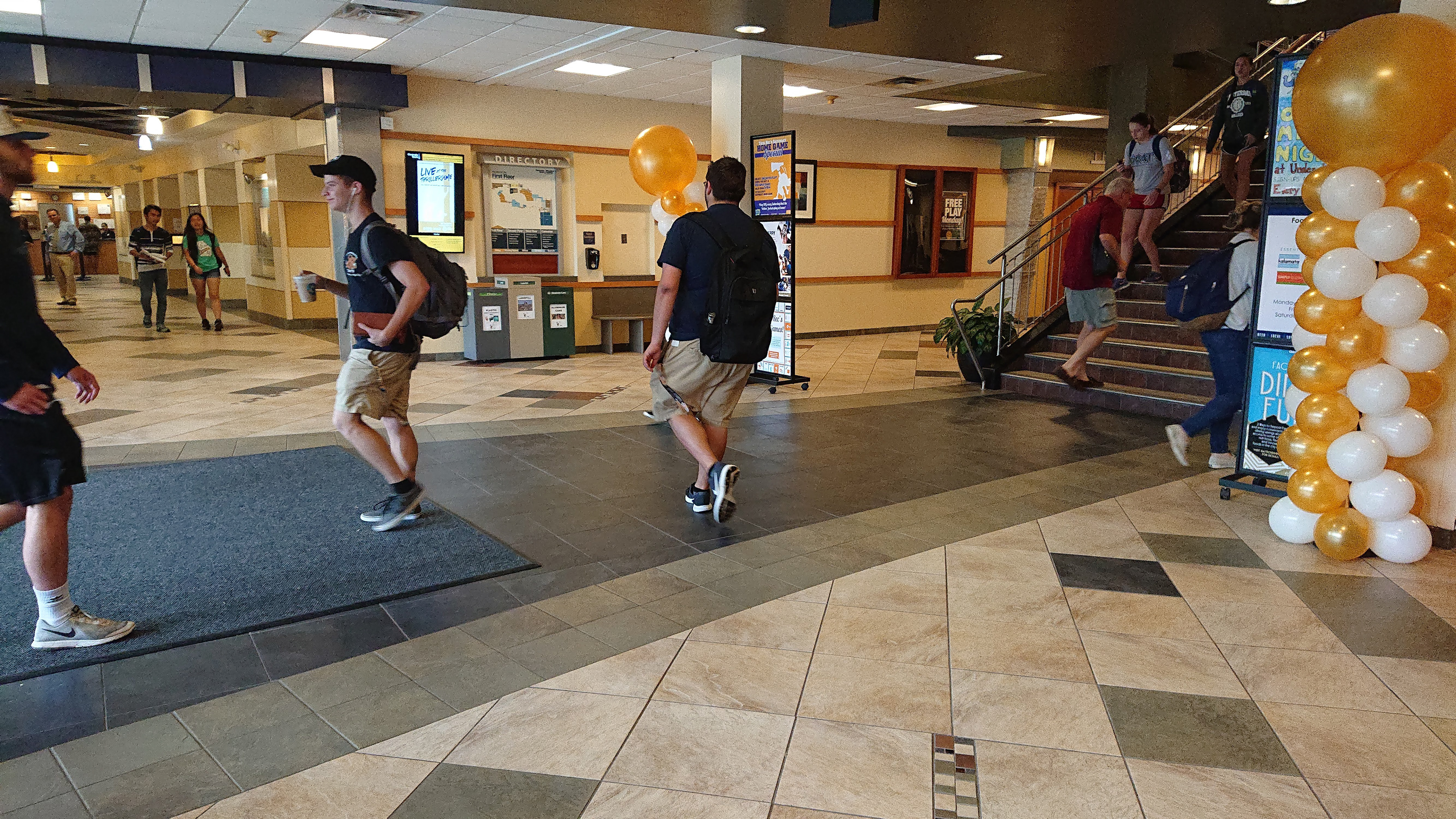
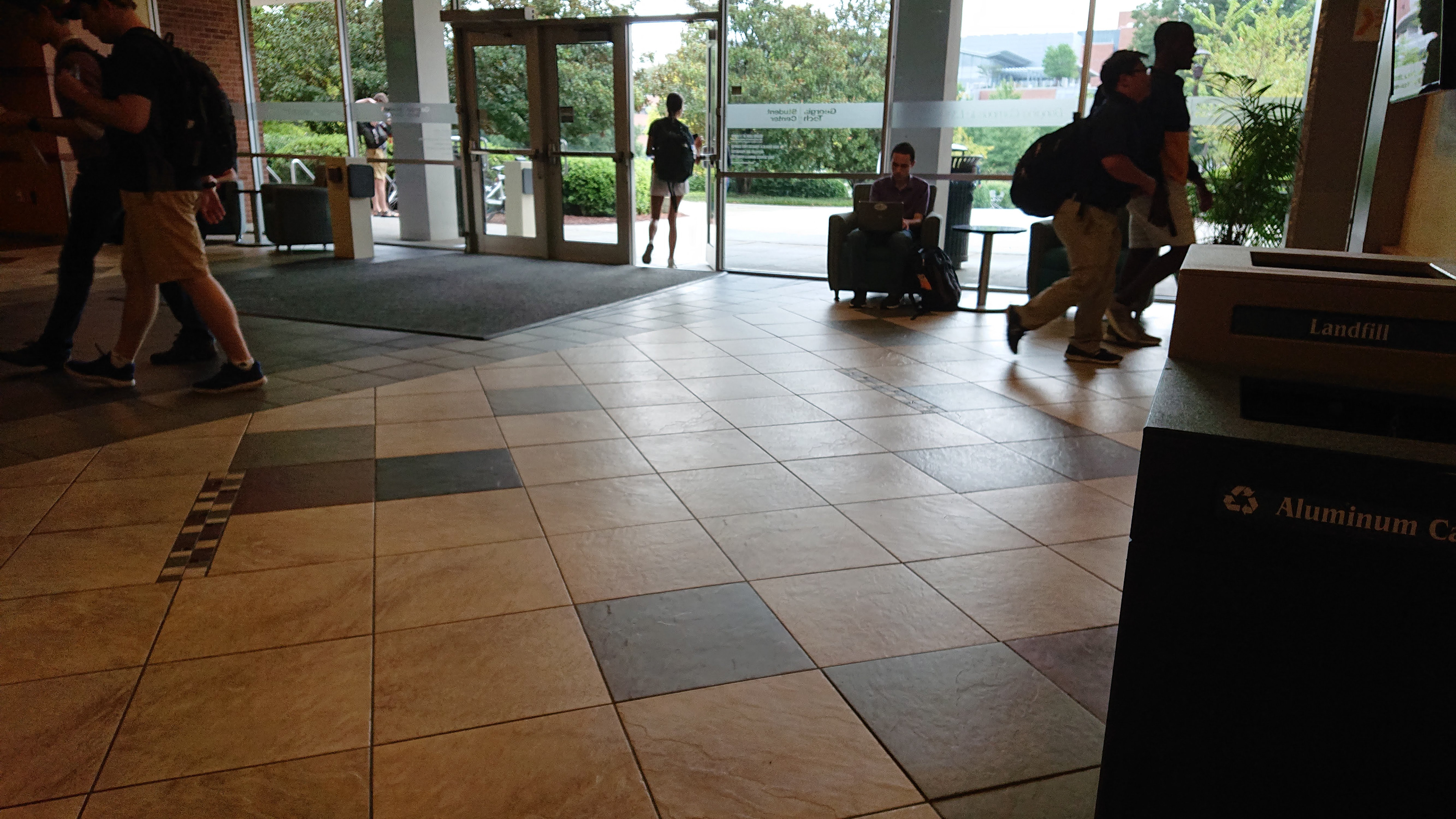
We then compared our observation findings with other areas around campus to create a more complete problem space and design requirements.
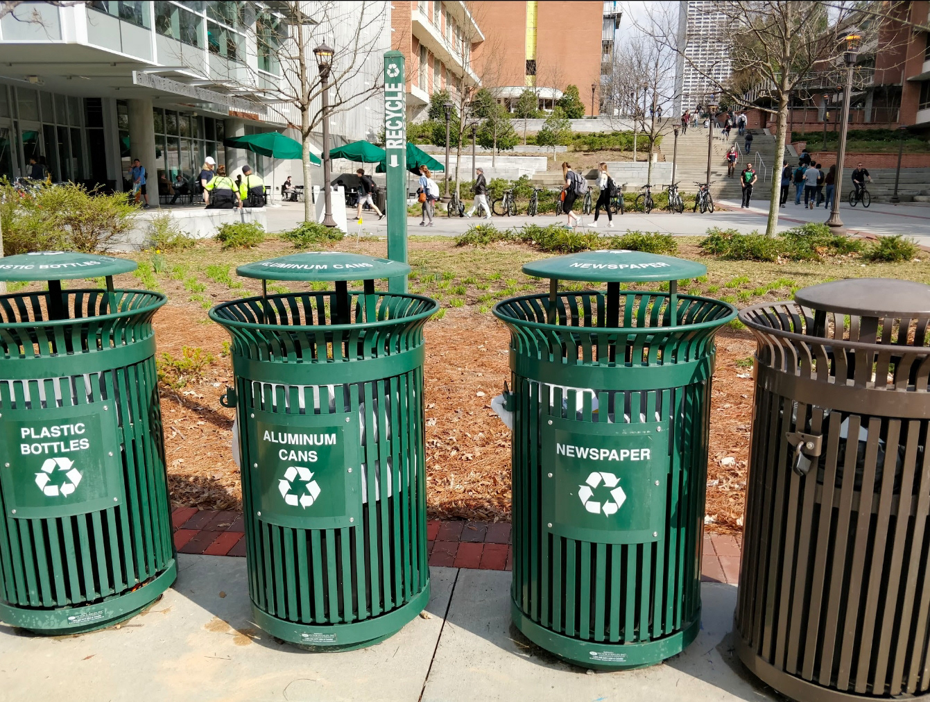
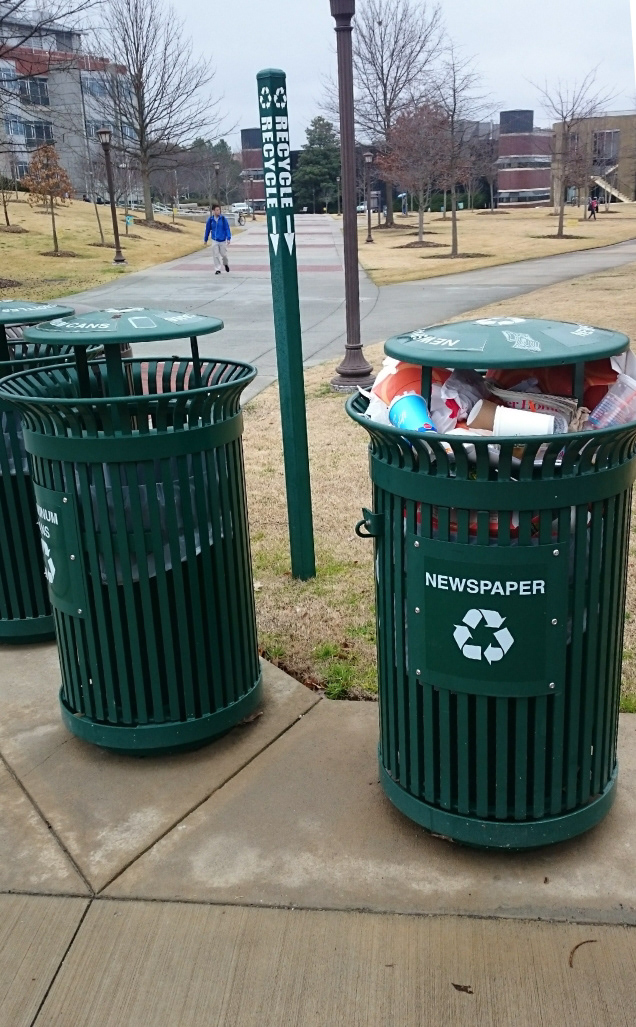

Observation Findings
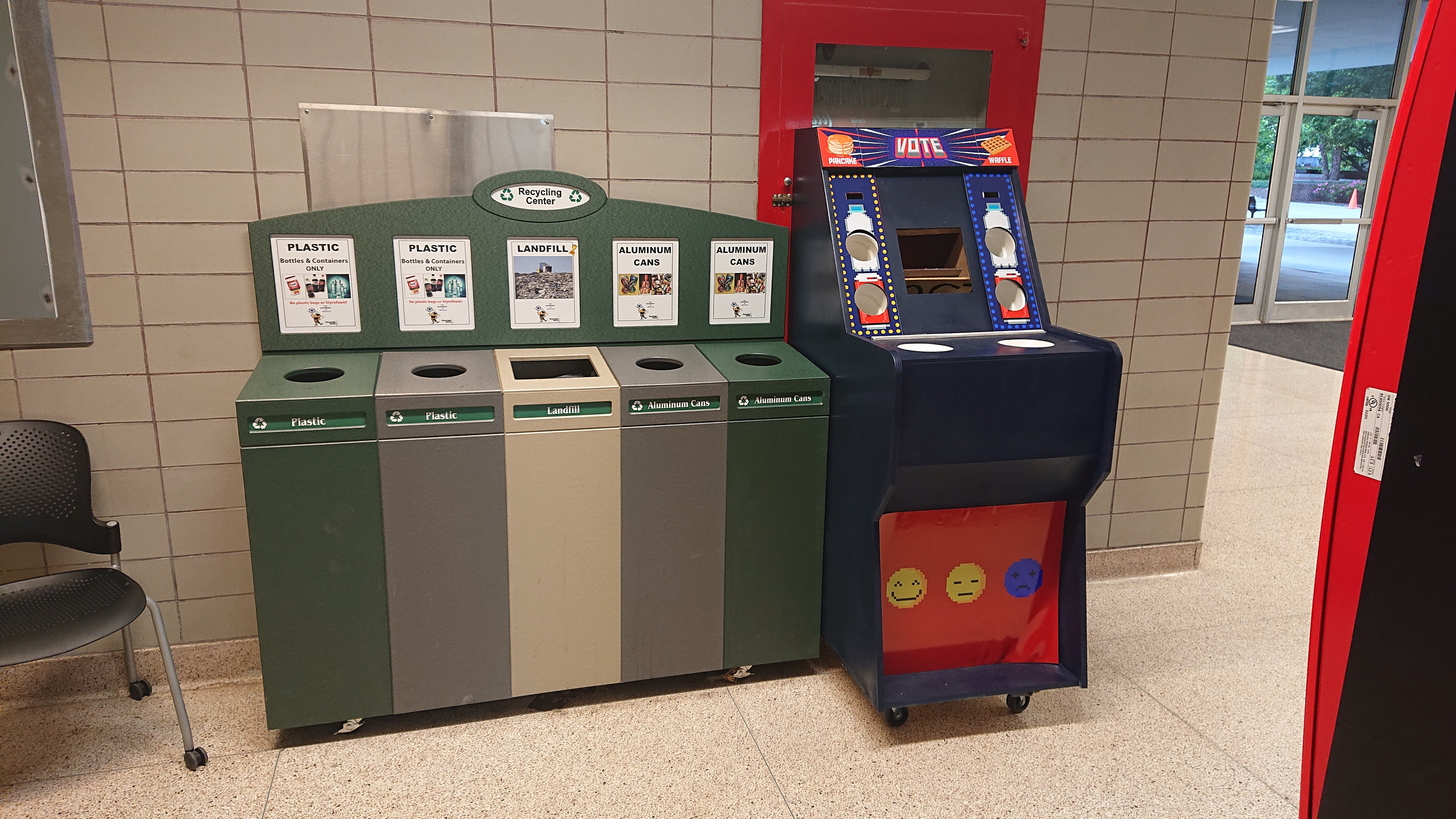
Waste: We observed that waste bins would receive high use, however, recycling bins received no usage during our observation sessions and incorrect usage when observing other bins across campus.
Location: We noticed that independent waste bins would receive higher preference in placement in higher traffic areas. While this allows for a more efficient traffic flow, it puts more load on the users to go out of their way to recycle.
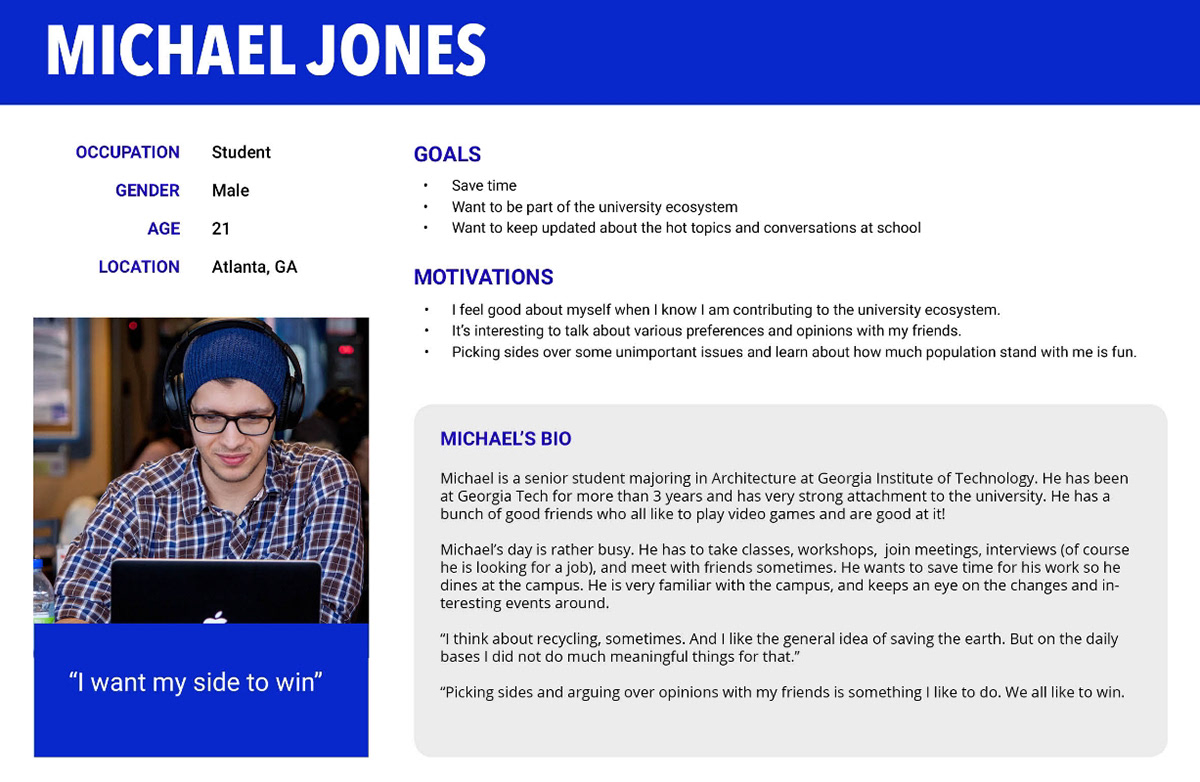
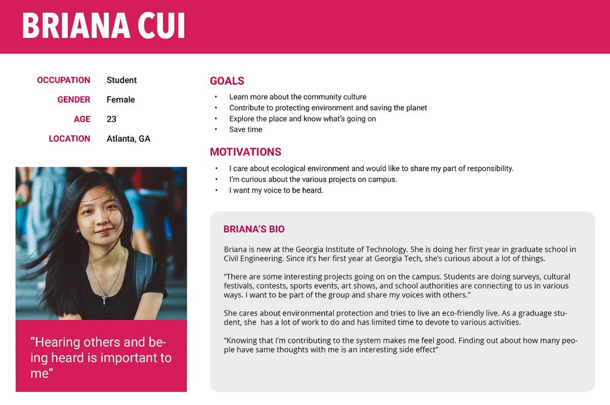
The Users
It's here we look at understanding our users to begin linking them to this problem space and identify opportunities and constraints
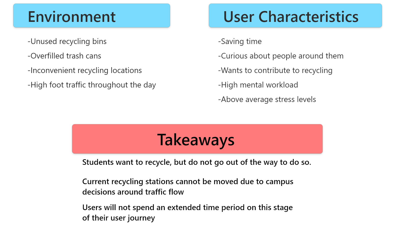
Putting the research together
Putting our previous findings together, we were able to set the scene for our ideation process
Concepting
Brainstorming
We began our ideation with 2 initial brainstorming sessions and noticed patterns begin to develop with our concepts.
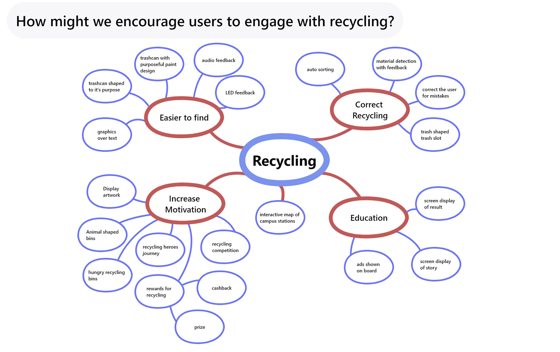
Brainstorming Takeaways
We quickly eliminated a simple redesign of the recycling bins. We believed the underlying problem did not lie in the usability of the stations, but in the time management of the users. Students understood how to recycle with the current bins, but did not believe they had the time to seek out a bin, thus, unknowingly, ignoring them entirely.
Understanding that we were unable to create a method that involves zero interaction with recycling, we began leaning towards a gamified approach. This would encourage competition within users and create a sense of fun with recycling, encouraging our users to take the time out and go to our product.
Initial Concept
We initially considered using a pure competitive game system to encourage users to recycle. This system would respond to how a user recycled and respond accordingly. This would not only create a sense of competition, but also passively educate users on correct recycling.
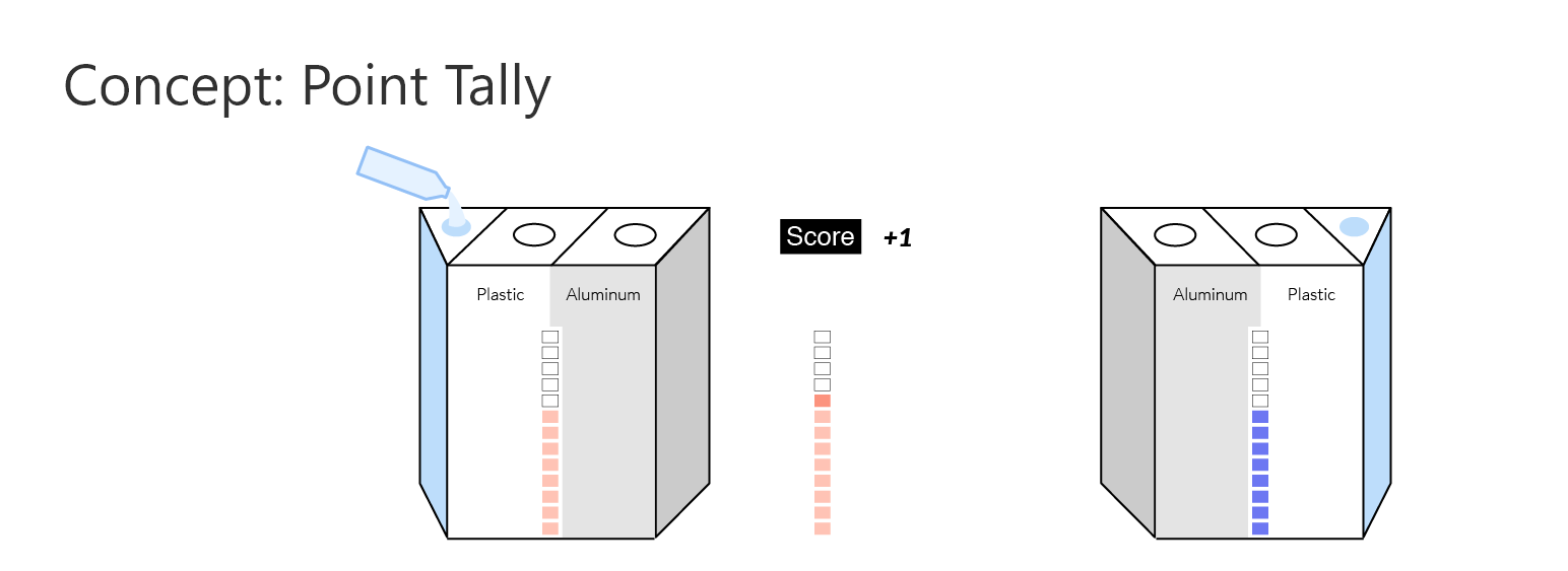
We decided to award more points for success rather than subtract points for failure. This way, our users would still feel a ppositive feeling from using our product.
But how will we encourage users to compete?
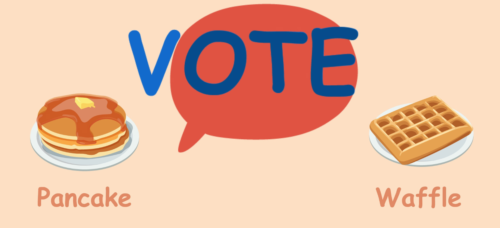
Knowing users will quickly grow tired of a game without a goal, we created our voting concept. Can we encourage people to recycling with silly voting? We purposefully chose "trivial" voting topics to encourage more fun in this quick interaction.
Concept Validation
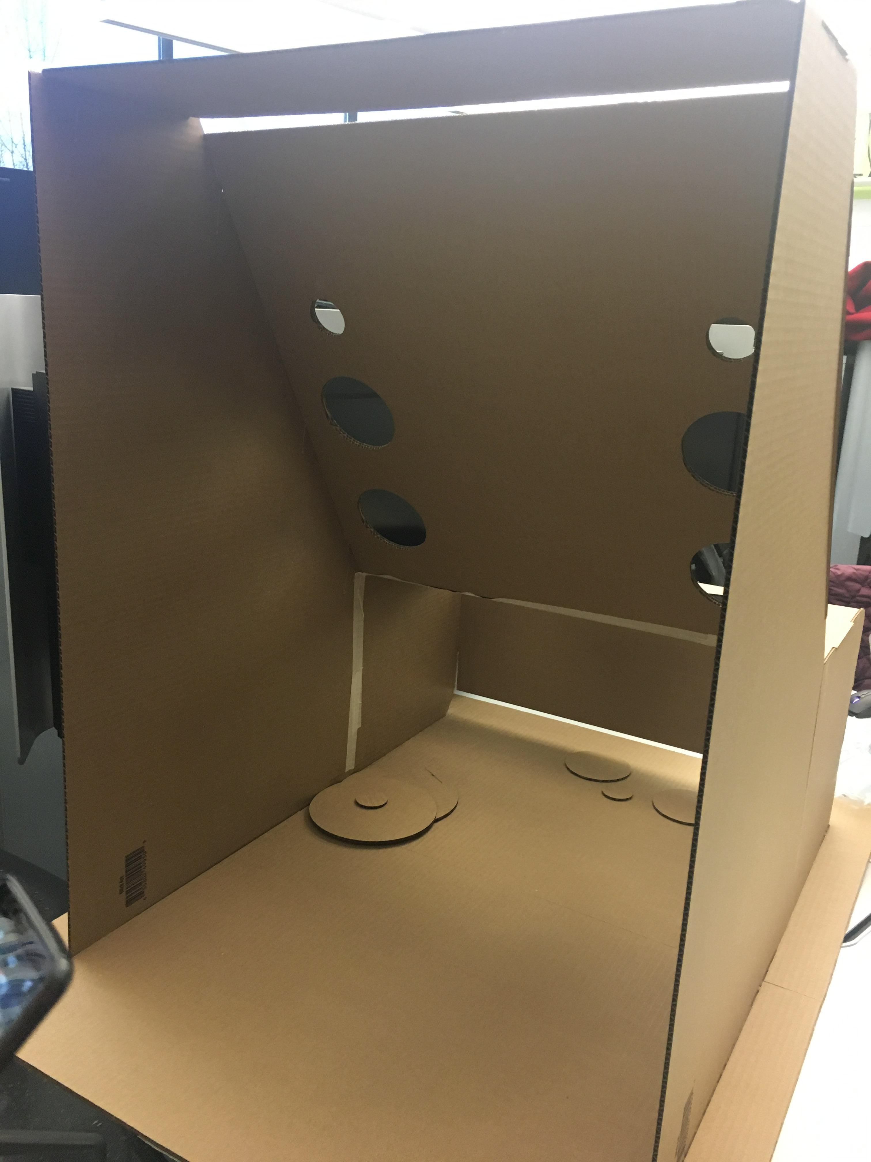
In order to quickly test our call to action, we created rough cardboard voting boxes and placed them around several campus locations. Over a weekend, we gave no instruction to boxes left around campus and would see what happened after the end of the weekend.
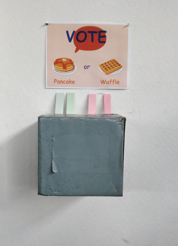
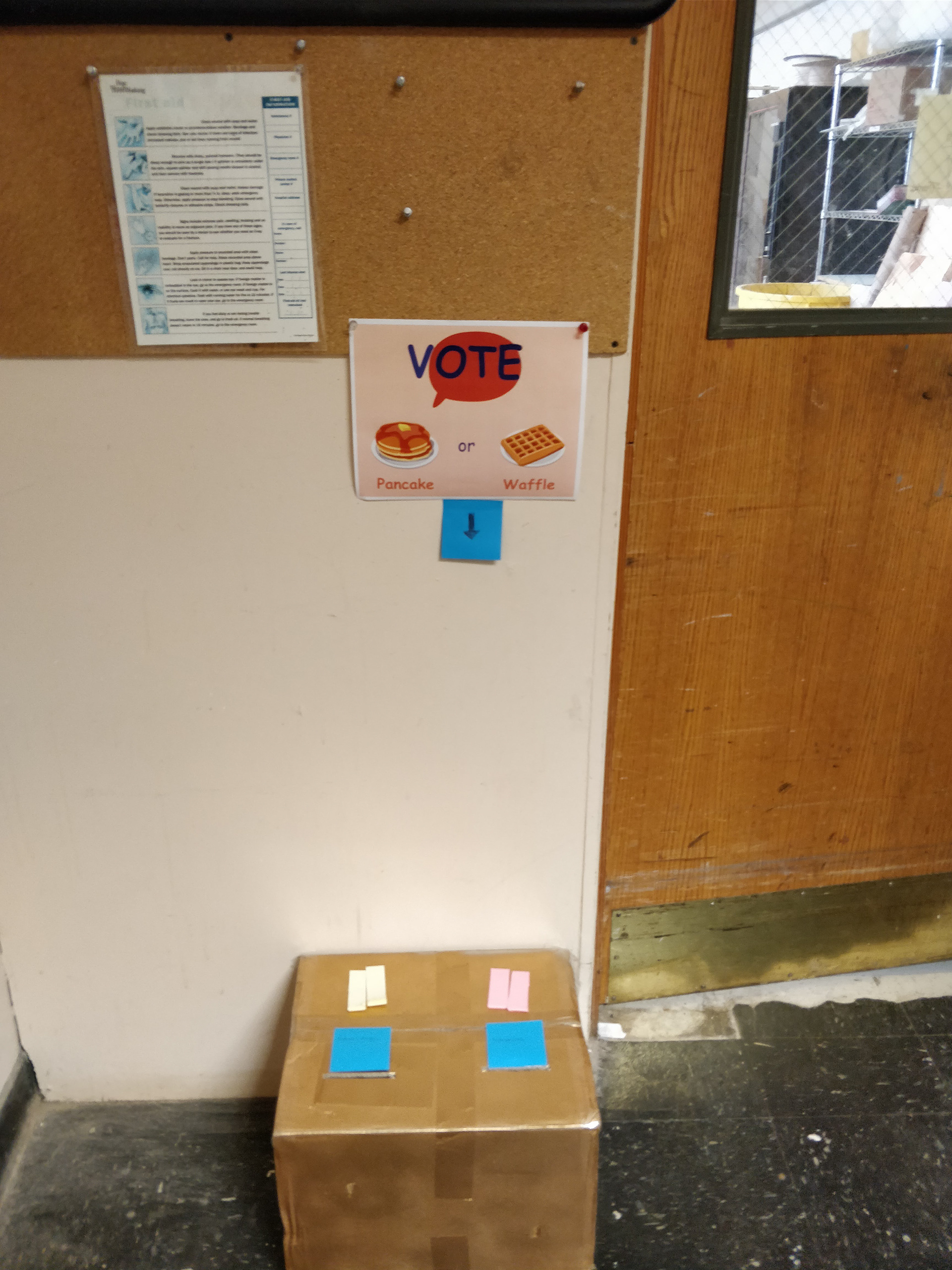
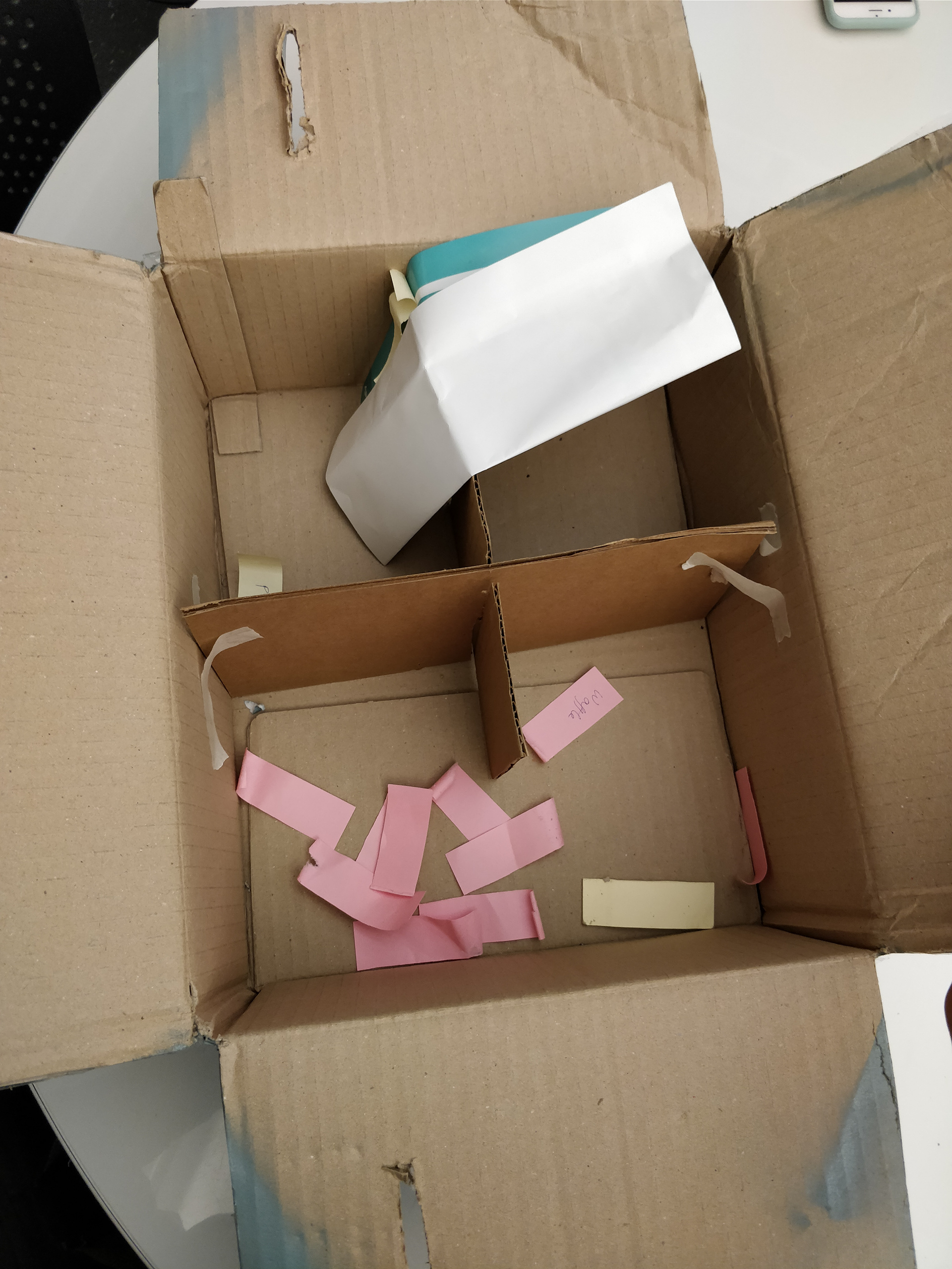
Even through a low traffic weekend, we received a variety of response types, encouraging us to proceed with this call to action.
Final Design
Physical Design
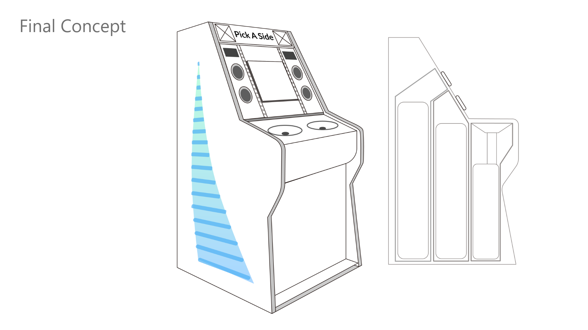
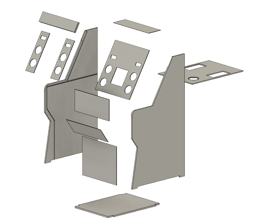
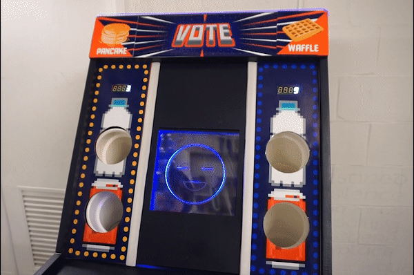
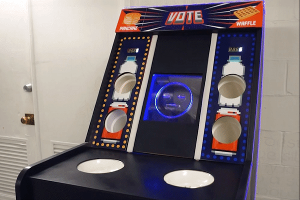
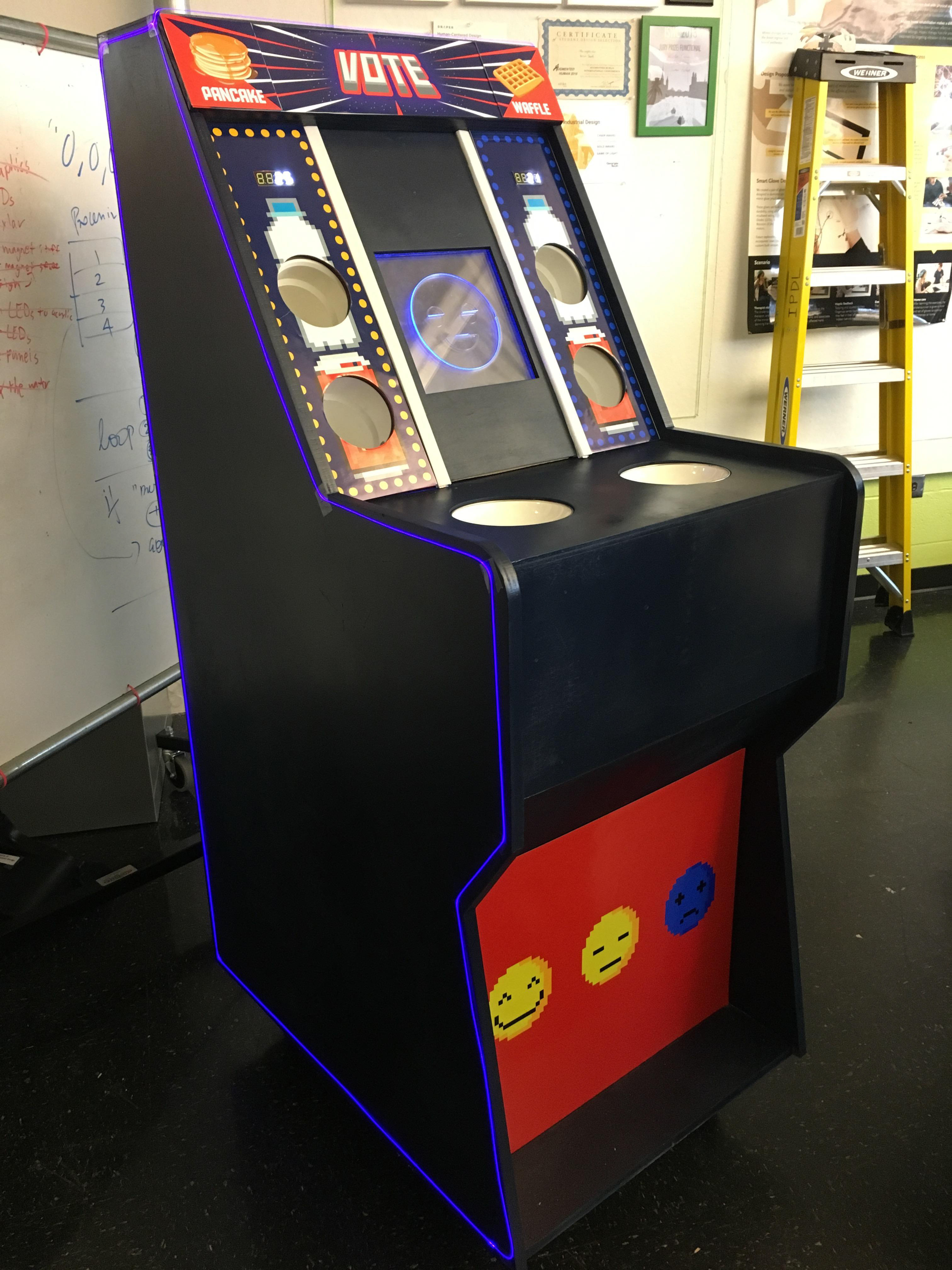
Embracing a fun, video game theme, we created a retro-arcade machine with recycling as the interaction.
We designed the machine to resemble an arcade machine, but designed the interior, underside to be easily replaceable and interior top side to allow room for electronics. In this design, we also created our interactive electronics requirements. All that was left to finalize was the screen.
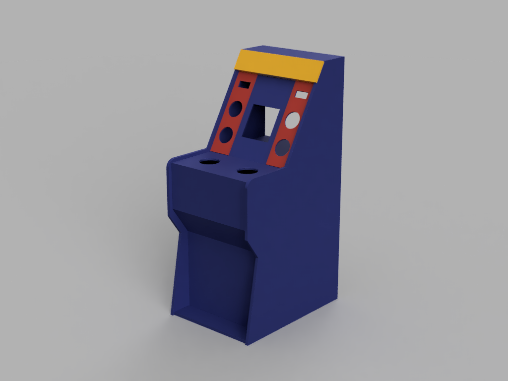
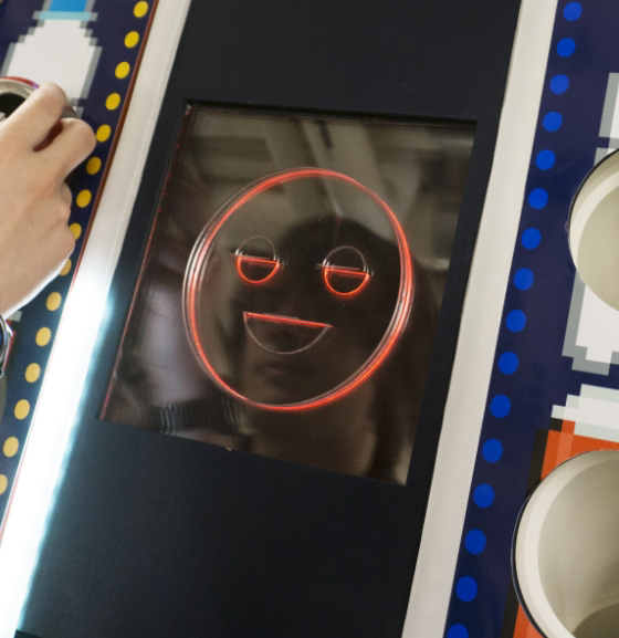
"Screen" Design
Embracing a "low tech" approach, we created a lo-fi screen to give simple responses to users. This way, users can receive a response without needing to slow down to process a response. We also did not believe there was any reason for any higher fidelity, more expensive screens.
The New User Journey
Our journey map follows the emotions the user experiences throughout their journey, allowing us to have a better understanding of how our user will respond, and what they will be experiencing before and after our experience.
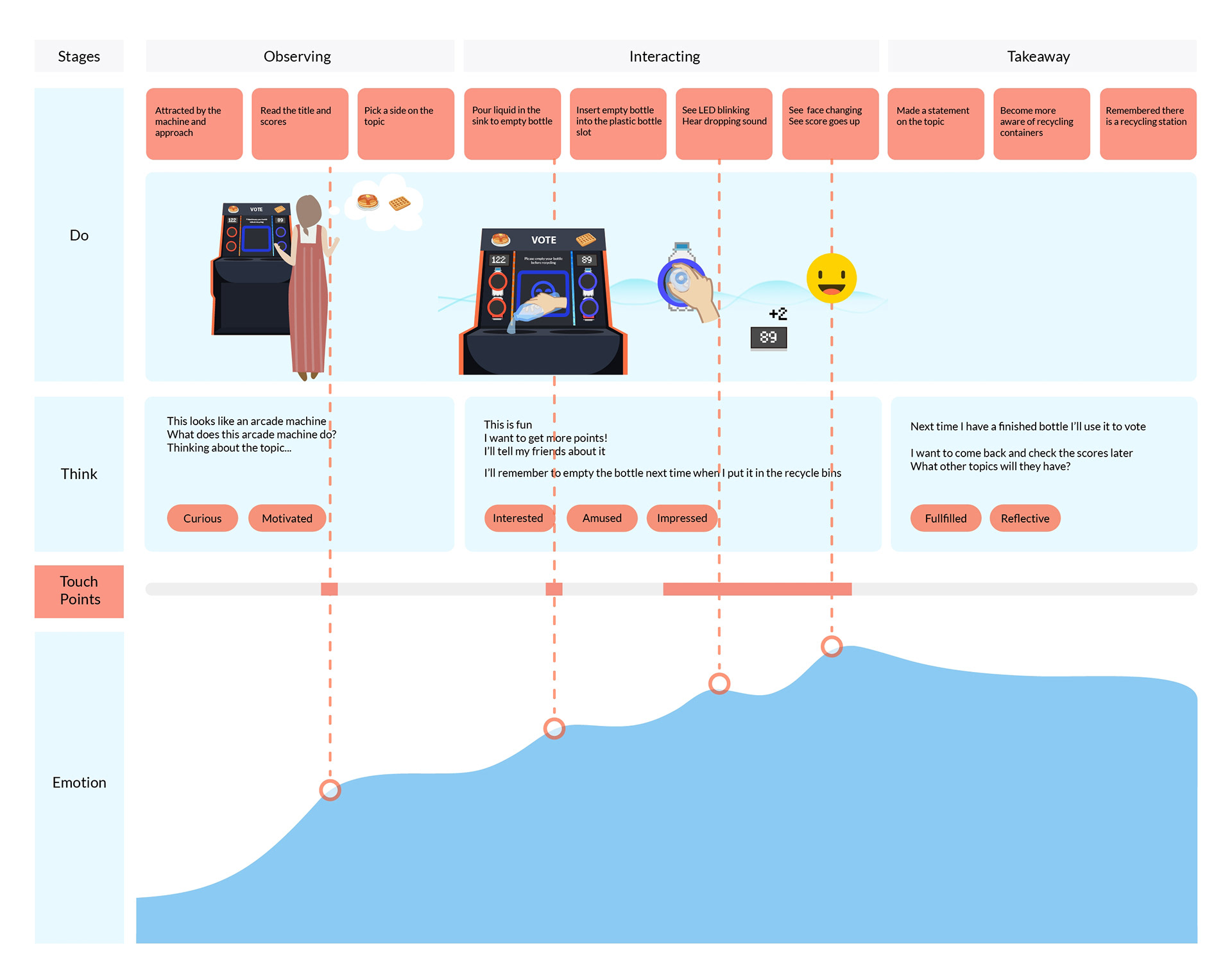
From a schematic perspective, we have mapped out what a user will directly experience, depending on the scenario.
Fabrication
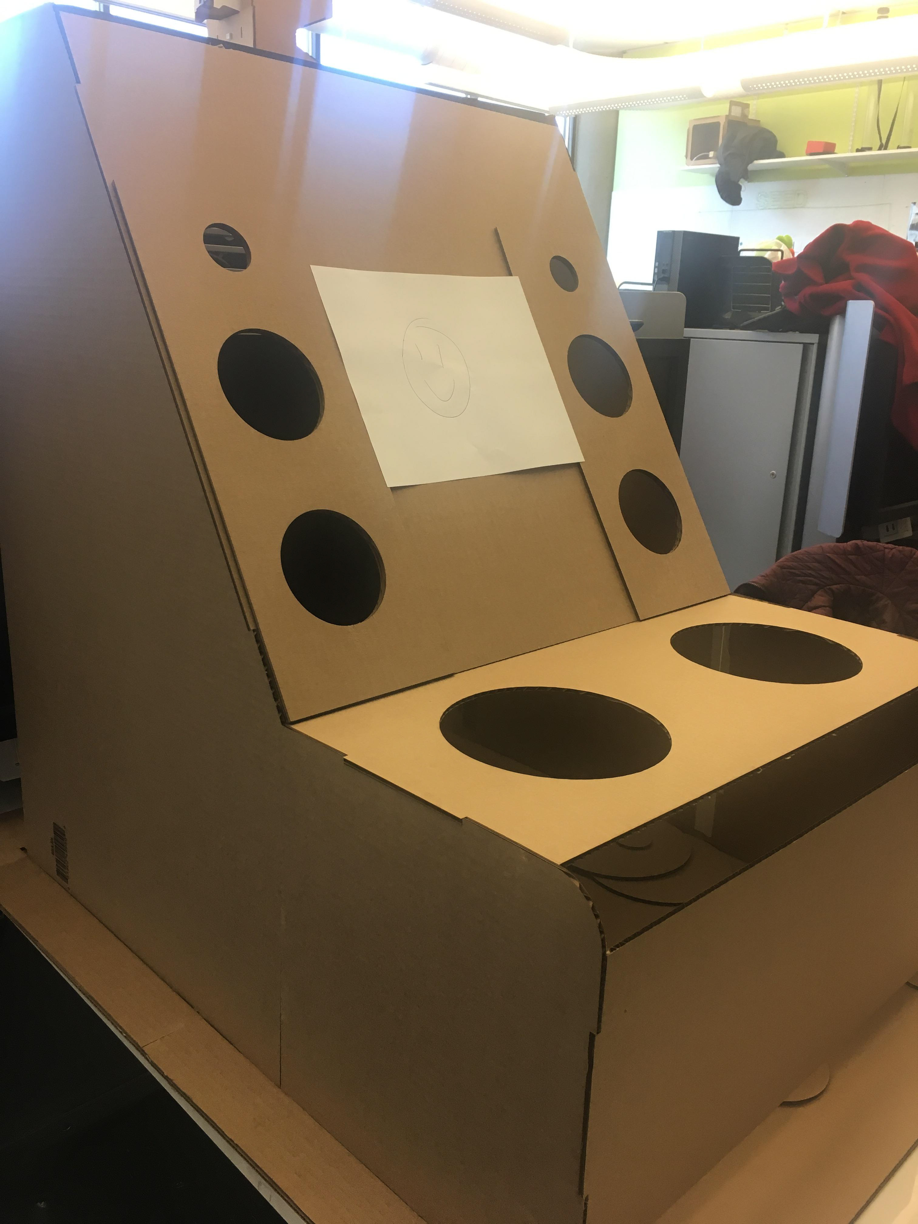
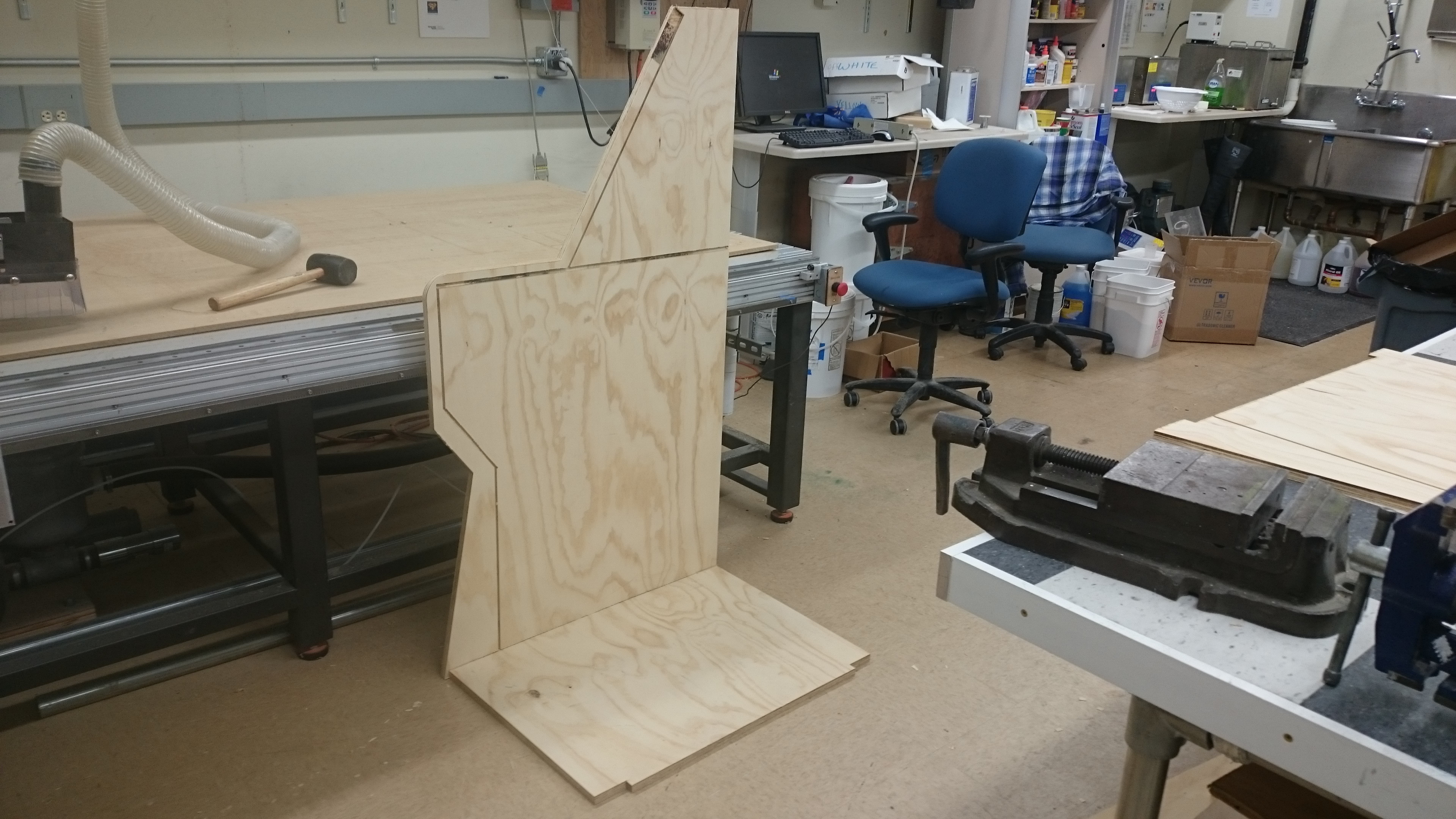
A quick cardboard model was made at 1:1 scale to help us begin testing final dimensions and have a test unit to prototype sensors on during the rest of the build process.
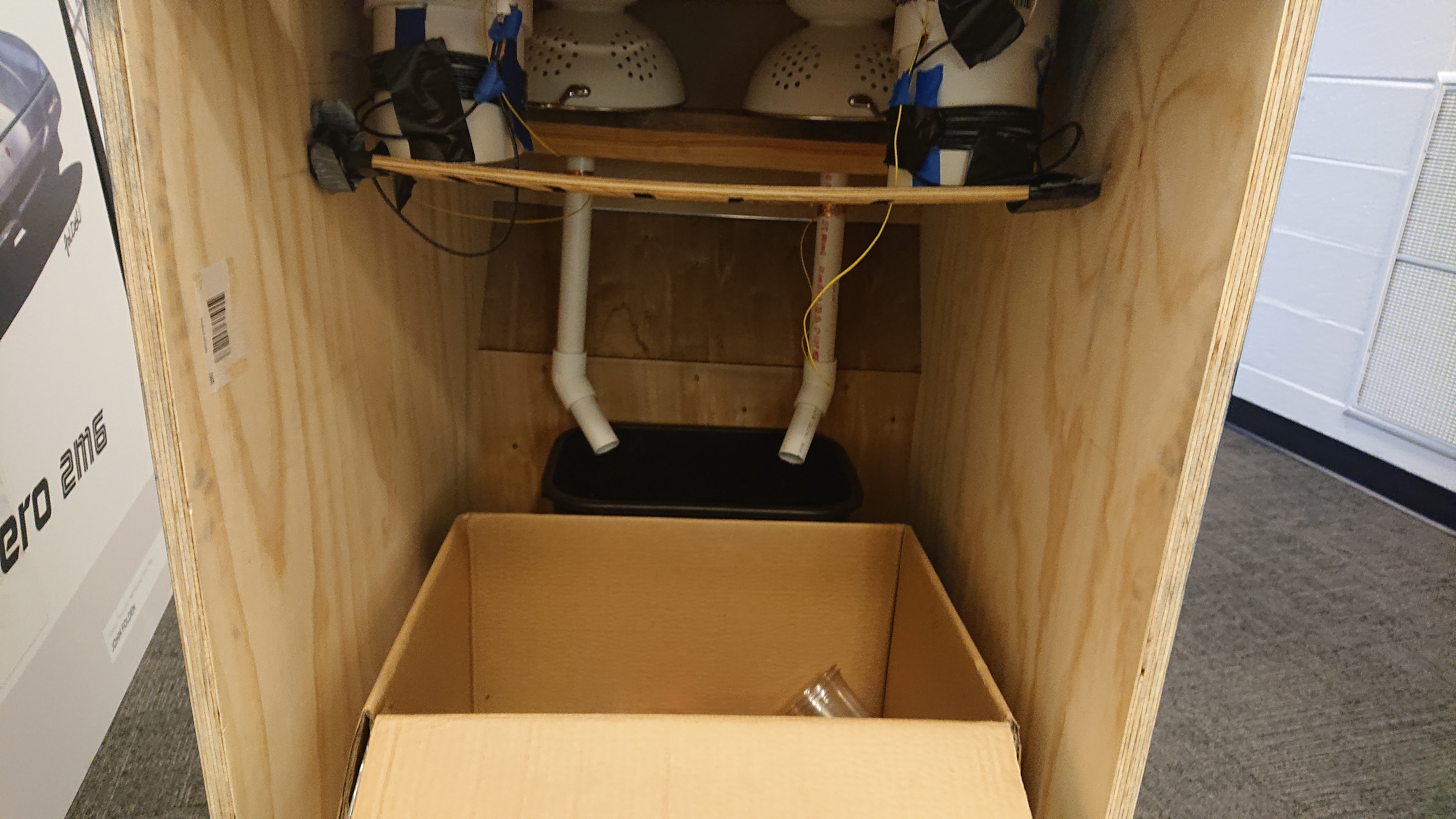
The main body was fabricated from CNC and laser cut plywood. The CNC slots allowed the body to sandwich together with a clean outer surface without any visible screws. This method also allowed us to create removable pieces for any design and fit changes that might need to be made later.
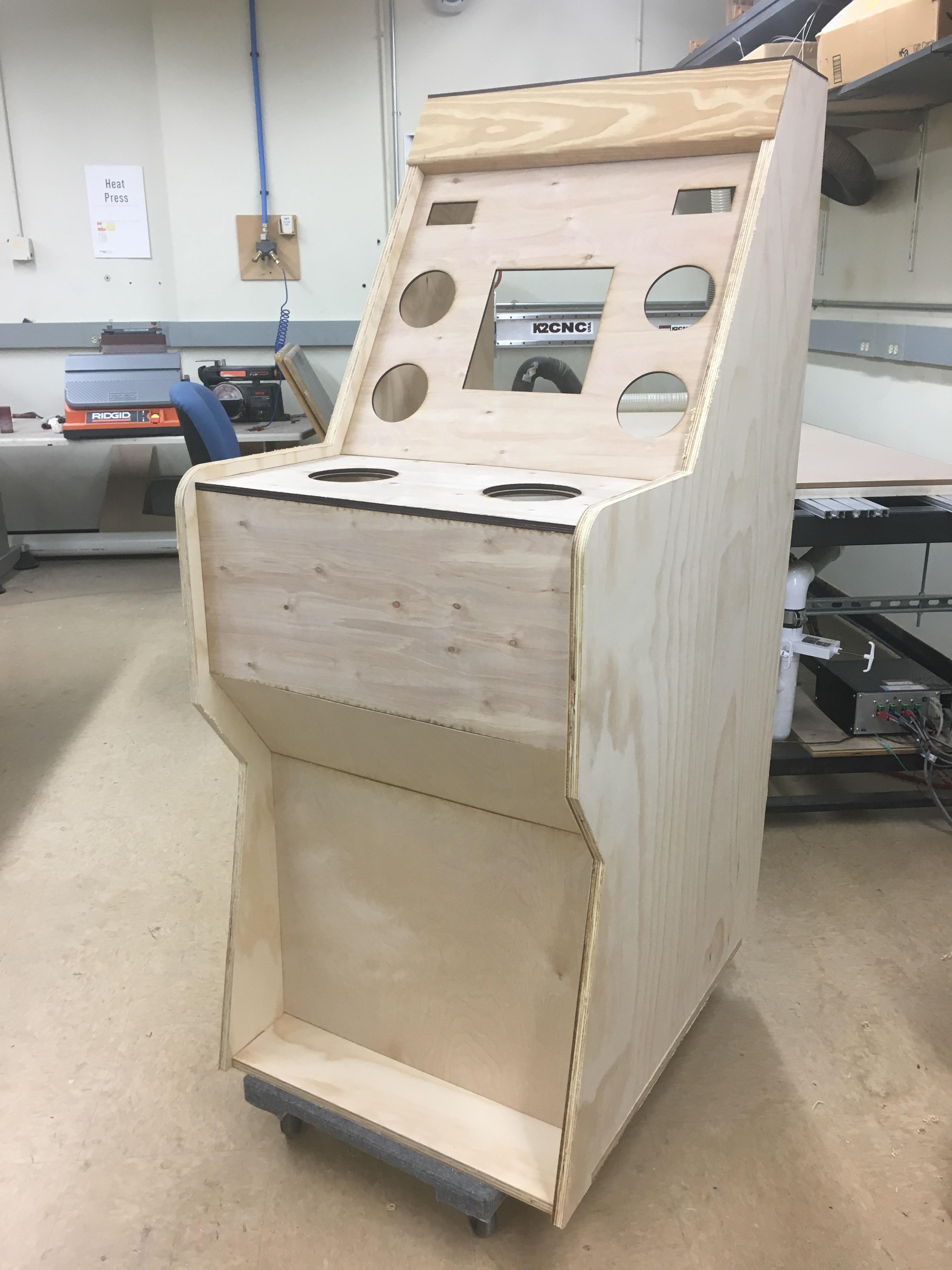
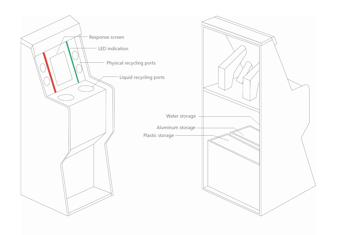
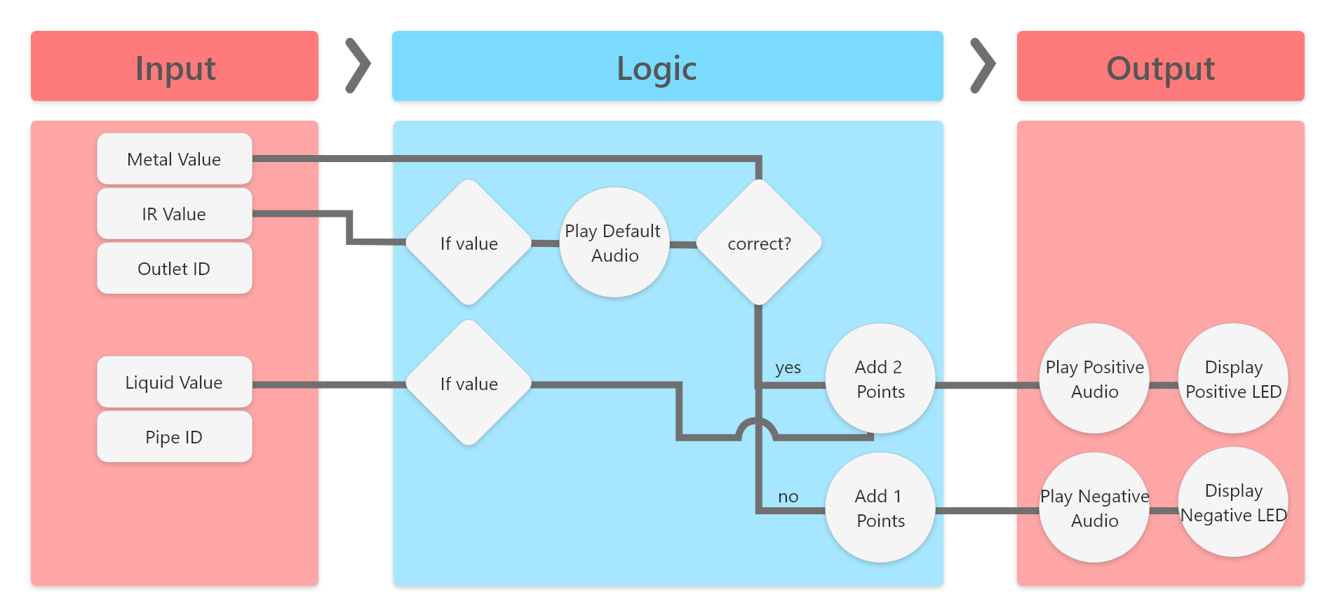
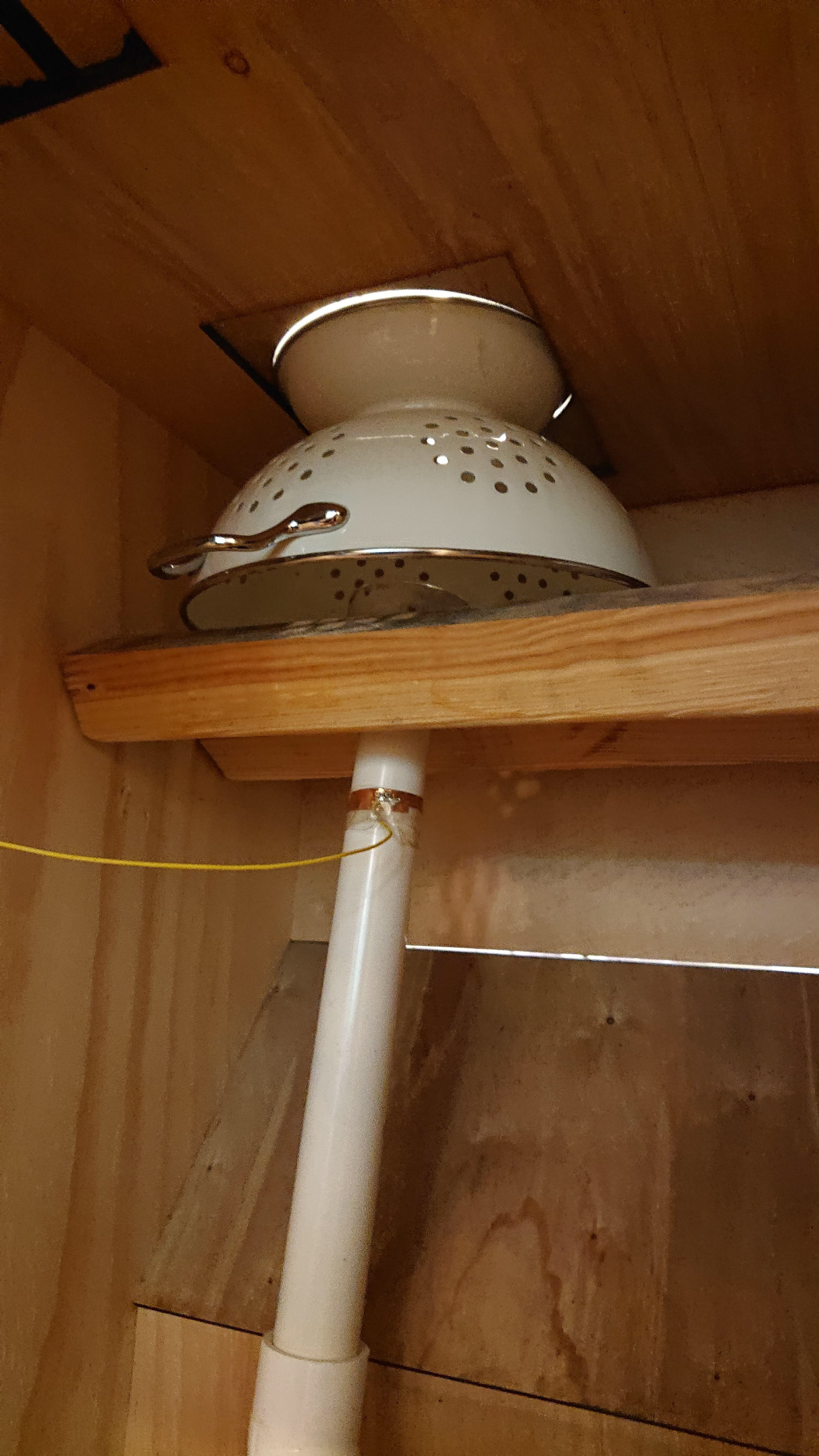
We used IR sensors for presence, custom magnetic coils for metal detection, and custom capacitance sensors for detecting water in the product.
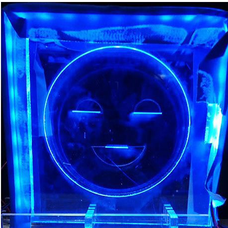
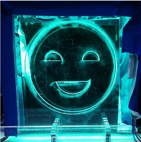
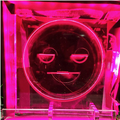
Layered, edge-lit acrylic was used for for the display, LED strips for lighting, and 7-segment displays were used for the scoring.
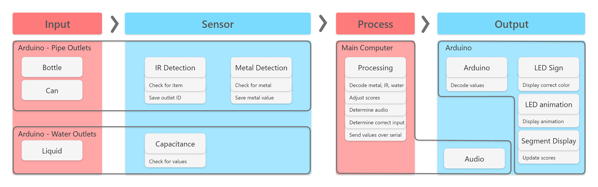
All the sensing was handled through an Arduino, while logic and audio was handled on a laptop with Processing.

A simplified sensor diagram of how we intend the electronics to communicate with one another.
Final Product
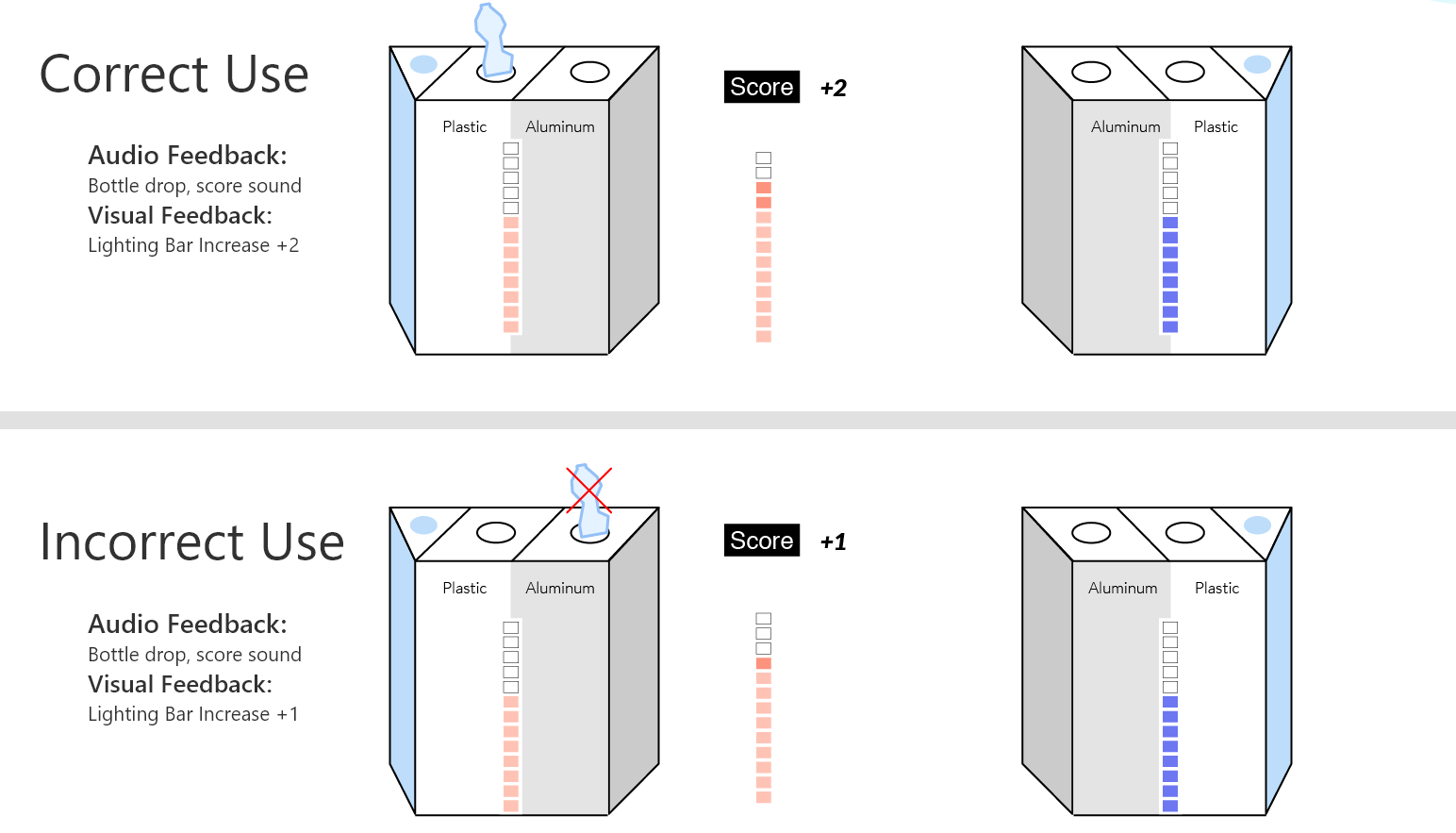
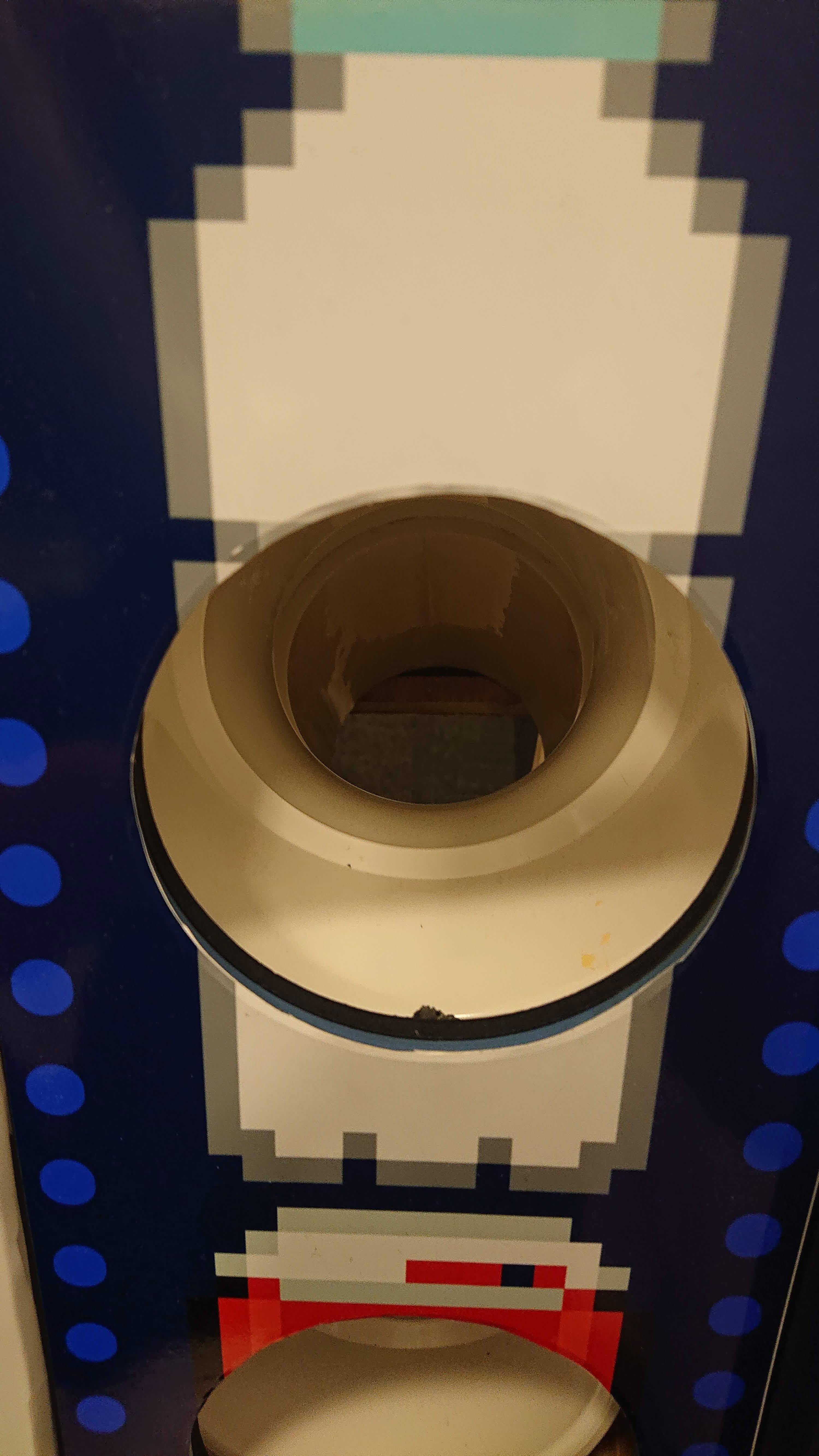
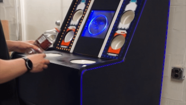
To score points for your team, simply recycle. Correct recycling scores more points and gives a positive response.
Recycling Correctly
Recycling Incorrectly
Empty your drinks for extra points for your team.
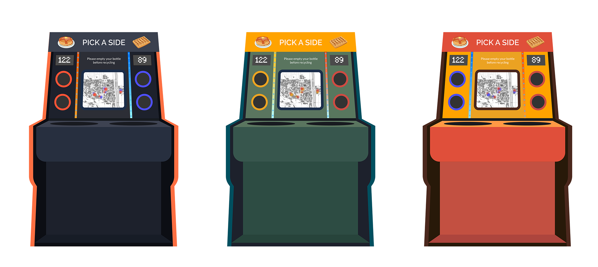
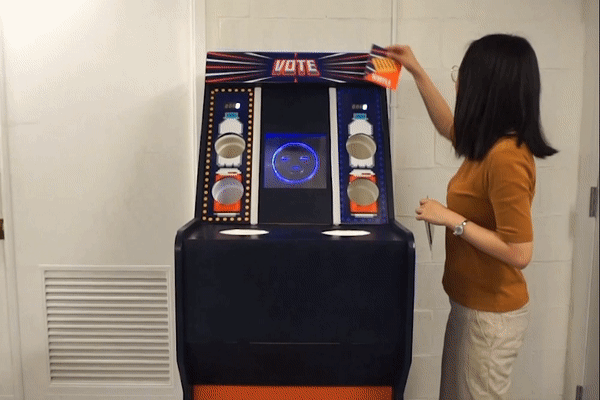
The voting topics are easy to change for long term use.
The final product
Reflecting
This was my first project that focused on the emotions of the users. It was also a great opportunity to practice quick sensor integration into a high fidelity model like this. It was a great opportunity to be able to quickly ideate multiple design and fabrication techniques to create a robust interaction. Unfortunately, due to time constraints of the project, we were not able to implement a proper round of user testing beyond a public demo, and I would love to see this used in a more formal setting for further iteration.
Architecting Emotions: During the course of this project, we found inspiration and success once we started designing around the senses and emotions of our users. This resulted in our gamified product turning that turned into a delightful experience for our users.
Validating Concepts Early and Quickly: Initially, our project was wildly pivoting trying to settle on a proper experience. Learning to make quick experiments and tests for concept validation is what gave us evidence and confidence to proceed with this product.
The Power of Rapid Prototyping: Over this project, we attempted multiple fabrication techniques over the course of this project. With quick manufacturing methods, we were able to test multiple materials and sensor technologies quickly, resulting in a robust product ready for user testing.
Users Expectations vs Reality: In order to get more votes for their team, users would begin taking water from each other, or switching where each other were pouring it. While they enjoyed this playful experience, we are worried for possibly encouraging too much competition.
Pancakes vs Waffles: During the course of this project, our team became internally divided on this topic (my vote is for pancakes). We noticed in our user testing that the voting results tended towards an even split as well.