The Challenge
How might we ease the experience of furnishing an urban apartment?
This project focused on designing an experience for recent college graduates furnishing an urban apartment. Starting a first job is already a stressful time, it becomes even harder in a new city with little resources. With our efforts, we looked at the entire user experience, from realization, to final placement, and created a mobile solution to assist in this time.
Team: David Howard | Dillon Weeks | Huaiwei Sun | Yuyan Duan
Role: Experience Design, Digital Prototyping, User Research, User Testing
Initial Research
Observations
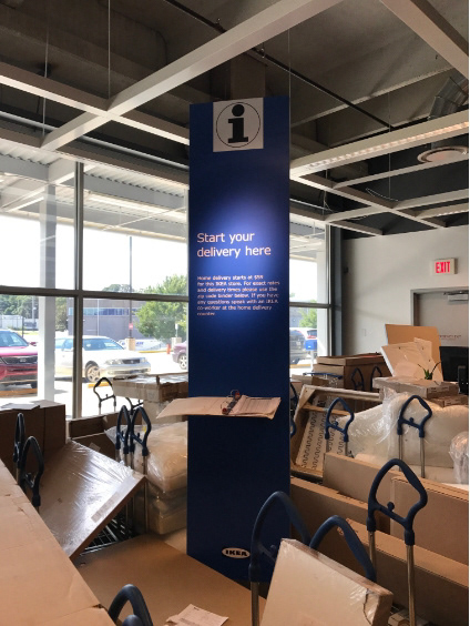
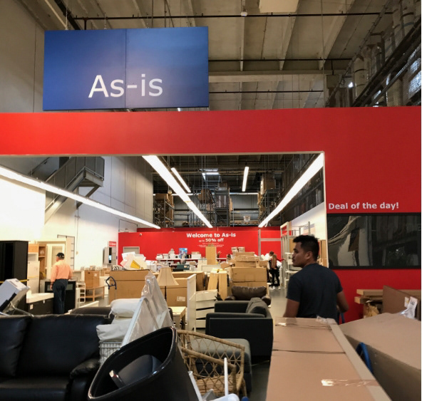
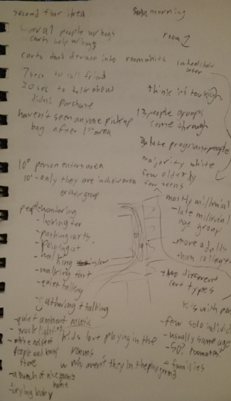
We initially conducted observation sessions in a local Ikea and Home Depot to begin getting an idea of the physical experience our target audience goes through. It was here that we learned that:
Store Purpose - Most users at Home Depot fell more within the DIY and long term owner audience, vs Ikea, which would see customers of various backgrounds.
Most users did not have a clear plan of measuring. Some would bring measurement tools, while others appeared to estimate sizes.
High Prices - Price appeared to be a large point, as many customers would appear interested, look at the price tag, and then walk away.
Most users did not have a clear plan of measuring. Some would bring measurement tools, while others appeared to estimate sizes.
High Prices - Price appeared to be a large point, as many customers would appear interested, look at the price tag, and then walk away.
Surveys
We also sent out a survey across the country to gather initial data from our users and get a better general understanding of them. Some of the results we learned from here include:
Location - Users did not have a single location that they would look for furniture.
Resource Uncertainty - Many users were not sure what resources were available when buying furniture.
Plan Management - May users' largest pain points included, losing control of the budget, transportation, and uncertainty of the products.
Resource Uncertainty - Many users were not sure what resources were available when buying furniture.
Plan Management - May users' largest pain points included, losing control of the budget, transportation, and uncertainty of the products.
User Interviews
We interviewed 6 users that fell within our target audience from various backgrounds and locations to gather more qualitative information than our survey provided.
The Users
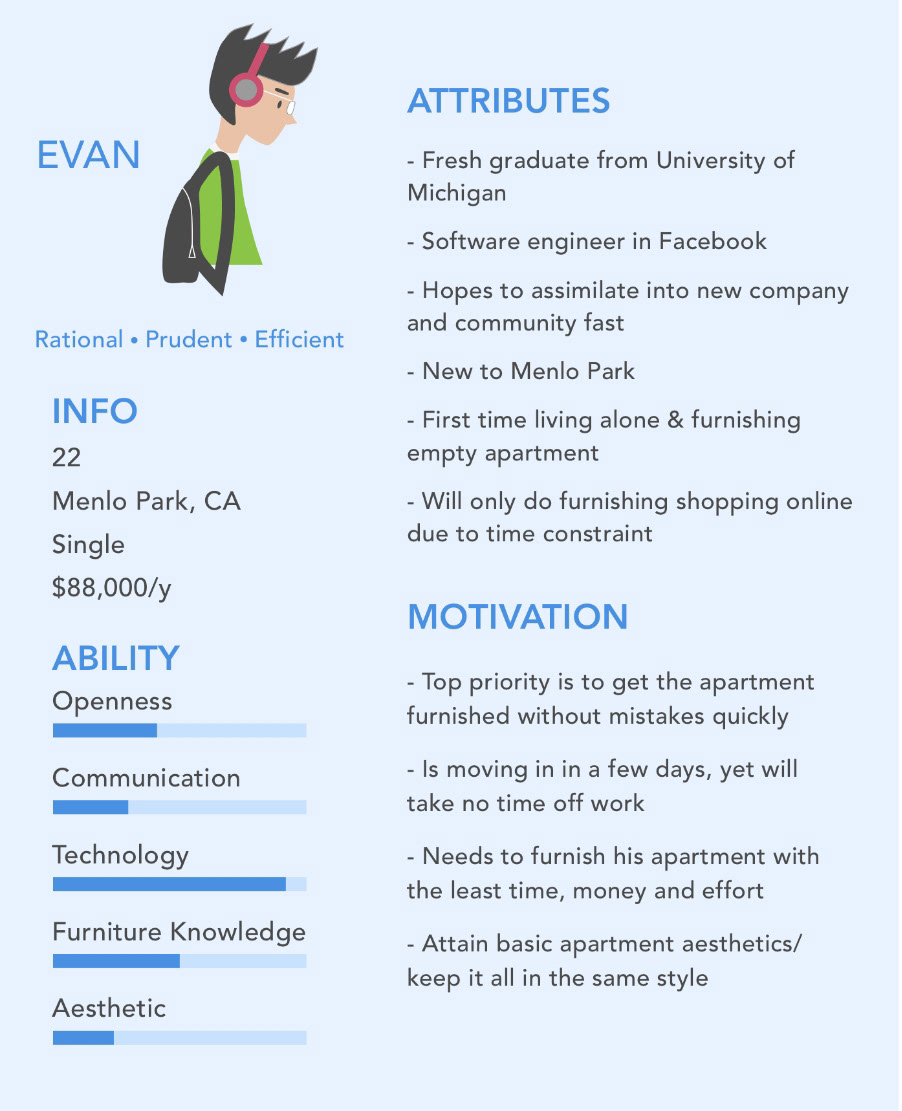
Based on the information above, we were able to create a rough image of our target audience in order to better address their needs. We noticed our users could be categorized into two simplified categories.
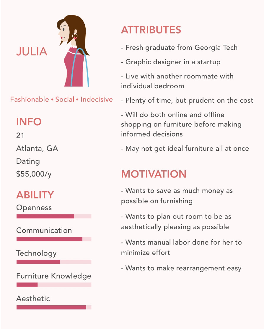
Task Analysis
We were also able to create a rough task analysis of the broader process that users would go through when buying furniture. Notice how the process does not end, but continues to loop based on time and budget needs until a user is completely satisfied.
Journey Mapping
Looking into a more general purchasing process, we created an emotion based journey map and noticed the touch points that would happen at various points in the process. Specifically we noticed the highest point of stress was the purchase itself, with a downward trend leading into it.
Competitive Analysis
Now understanding the user journey, we looked into different services that users could take advantage of. We noticed that there was a large amount of transportation services, where the highest stress points were for the users, however, this also gave us some insight that just another transportation service was not the solution.
Research Results
Finally, putting all of the above into a simplified synthesis, we gathered our users' primary paint points and values into our primary opportunity point for our design.
Concepting
Design Criteria
Before beginning our concepting, we created a list of priorities to consider and remember during the rest of this process.
Initial Concepts
By the end of this, we noticed our team was gravitating towards 4 different concepts that would need prototyping and feedback before proceeding. These concepts included: 1) An AI Planner, 2) Remaining Furniture Transfer, 3) Roomba, and 4) Gamification of Planning
AI Planner
The AI planner would attempt to create a layout of a furniture plan, with shopping links for the user based on a personality quiz that would train the AI.
Furniture Remain
The furniture remains, would attempt to link tenants within the same apartment complexes in order to pass off old furniture.
Roomba
The roomba solution involves setting a roomba into a new apartment in order to map out the room and keep in comparison to measuring furniture in-store.
Gamification
The gamification solution involved treating filling an apartment similar to the Sims games, where a users would have a 3D model of an apartment, and fill it based on "virtual" catalog.
Concept Validation
We took these concepts back to our users in order to gather more feedback and narrow to a single concept.
Based on the feedback and information above, the AI planner was the most feasible and user-friendly. In a future iteration we would love to add on additional approaches using a roomba or some distance measurement, however, within our timeline, it was not feasible to properly develop and test this as well during this phase.
Looking back to our journey map, we tracked which areas our solution would target and improve.
Design
Wireframing
We began by creating an initial sitemap of what we wanted the final design to accomplish.
We then created our wireframes of some of these features that could be shown to users for further feedback.
Final Design
From this feedback, we then created our final high fidelity prototype. It was here that we added a visual language and added in more functionality and robustness in the screens.
Prototype
Feel free to interact with our final prototype, made in Adobe XD.
Evaluation
Benchmark Testing
Using this final design we performed benchmark testing with three users. This test was a simple scenario that fit within our user research where they were asked to complete three different tasks:
1) Create an initial floorplan
2) Pick an initial floorplan
3) Acquire a full room recommendation
2) Pick an initial floorplan
3) Acquire a full room recommendation
Results
While there are clearly improvements that can be made to this design, our results were relatively positive, giving us hope for any future iterations that can happen and the final concept overall.
Reflecting
This was my first project that focused entirely in the digital realm. It was a new experience focusing on solely the user experience in a generic area. I appreciated getting the chance to hone my skills with digital development tools while also maintaining a proper user-centered design process the entire way through. We do believe there is a lot that can be improved, however, we quickly hit the limit of the tools that we were using for such an ambitious prototype. While, we were able to create a successful test with what we were using, we would love to this to a higher fidelity product.
Experience Designing: While mobile app design is still not my specialty, I have a new outlook on experience design within a digital solution.
Innovative Solutions: This project was a great chance at looking at a saturated market, and finding a hole in the experience that users could take advantage of. Specifically, this was a good chance to practice look for a non-obvious solution to a common problem.