The Challenge
From this prompt, our team looked wanted to create a story-like experience showing the the distribution of employees in the top 24 companies based out of the Silicon Valley Area. we did this through a scrolley-telling experience powered by javascript.
Team: David Howard, Zheru Jiang, Yixin Duan, Shuangke Li
Role: Experience Design, Front End Developer
The Data
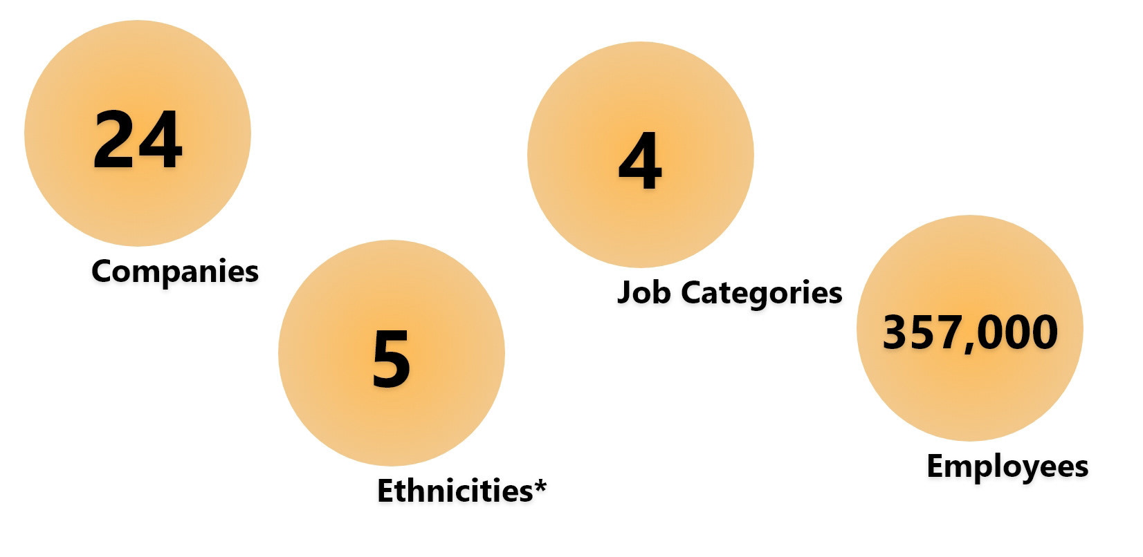
Using the 2016 EEO report from Silicon Valley, we combined aspects of multiple datasets into a single CSV file that could easily be parsed in code. We were able to break all of the data in 5 different categories of data and farther simplified the "other" categories into something that could be visually seen in out visualization. Thinking of possible users, we decided to focus on the top 34 companies as a way to create a better visualization of the data instead of possibly over-saturating the information into something that cannot be investigated.

The Goal
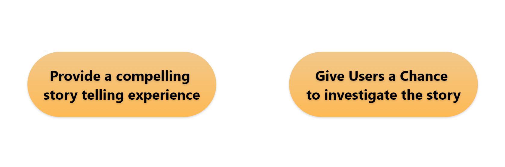
This is what we asked ourselves in the early phase of this project. We knew there would be multiple user demographics that would want to see this from HR employees, to job seekers in the area. Attempting to satisfy both ends of this spectrum, we were able to break this down in simple design goals going forward.
Final Design
Play with our live product here!
Created through HTML, CSS, and Javascript, our final design consisted of a scrolley-telling experience. We designed it to walk a user through the scenario, and then allow them to investigate different qualities of them as they wished. As a result, the final product was divided into three sections.

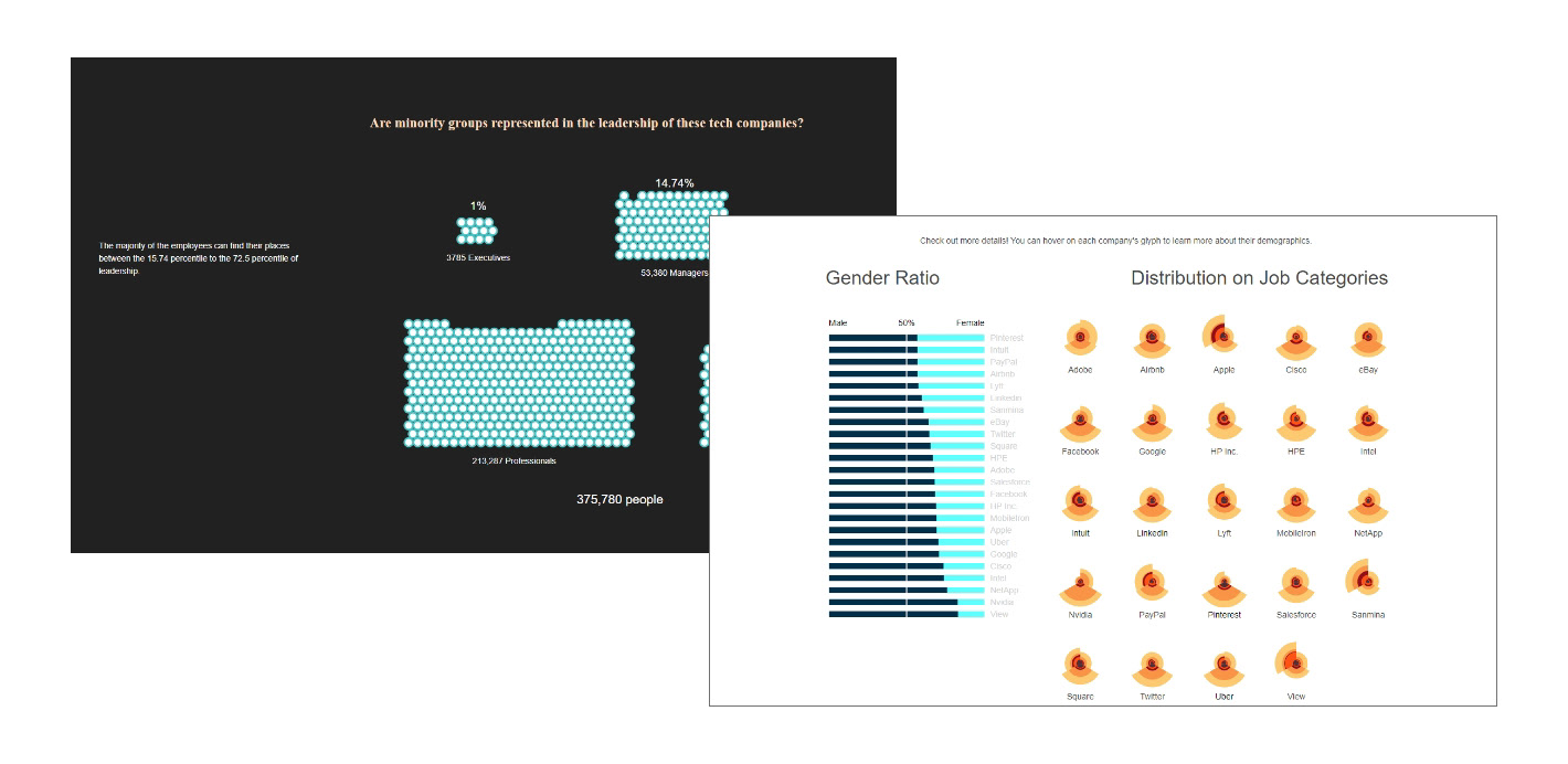
The Walkthrough
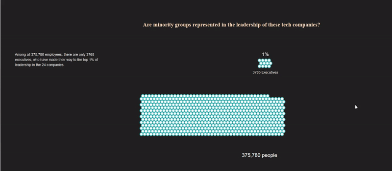
We initially created a walkthrough that would advance by scrolling through the page. Because this was so broadly focused, we used a dot plot as a way to generalize the data.
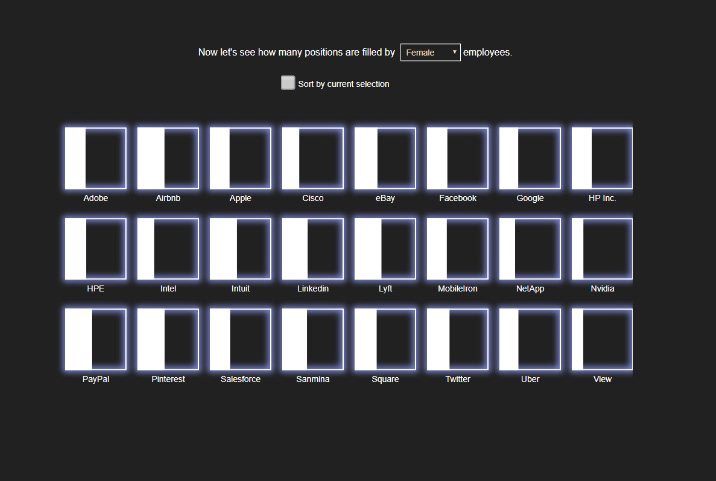
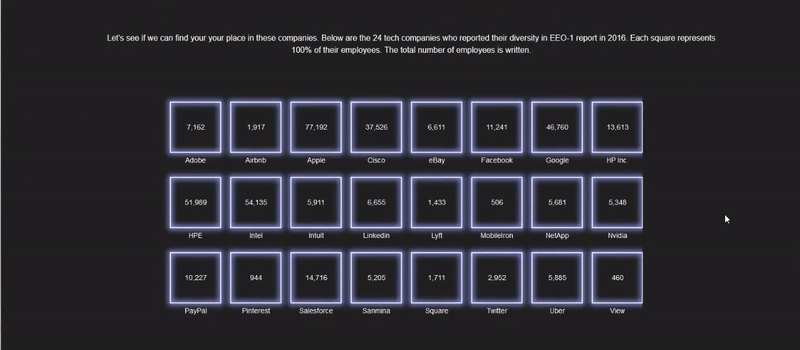
Filtering and Sorting Companies
We then created a series of box and mosaic graphs to allow users to look at high level data and filter/sort accordingly.
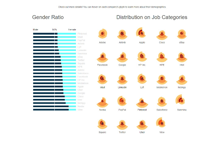
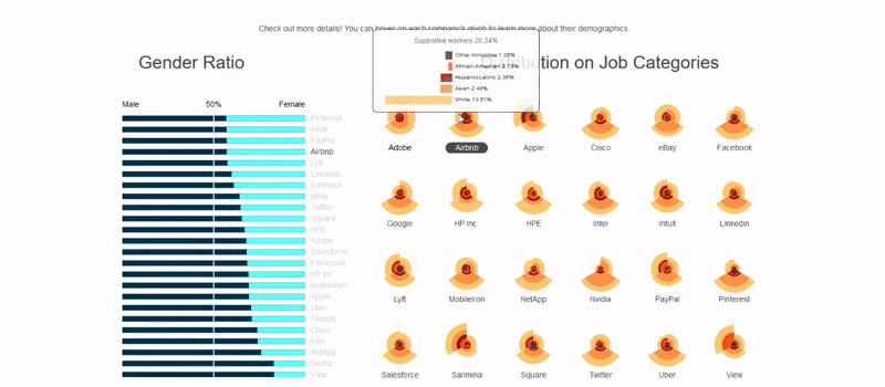
Job Category Distribution
Finally, we used interactive bar charts and rose charts to show the user detailed distributions of the companies in relation to each other. Due to the density of this information, we chose to show the details on hover as opposed to a drop down style of approach.
Reflecting
I had been wanting to sit down and get good at front end development for a while, having focused mostly on hardware design/coding, this project was a great chance for me get good practice for developing for the web. Even more so, this project was a great chance to put these skills into a good project. Although the data was not as rich as we would have preferred, we were still able to get a large amount of use out of it and realize the design intentions.