The Challenge
How might we improve the customer experience of Starbucks while not changing the product?
Our team performed a three month design study on the customer experience of Starbucks. Through data driven design choices, we created, iterated, and tested an interactive kiosk to enhance the purchasing experience. Due to IRB limitations, the claims stated here cannot be generalized to the Starbucks community as a whole.
Team: David Howard, Hanyu Gong, Shengxi Wu, Daier Yuan
Role: Physical Prototyping, Experience Design, User Experience Research
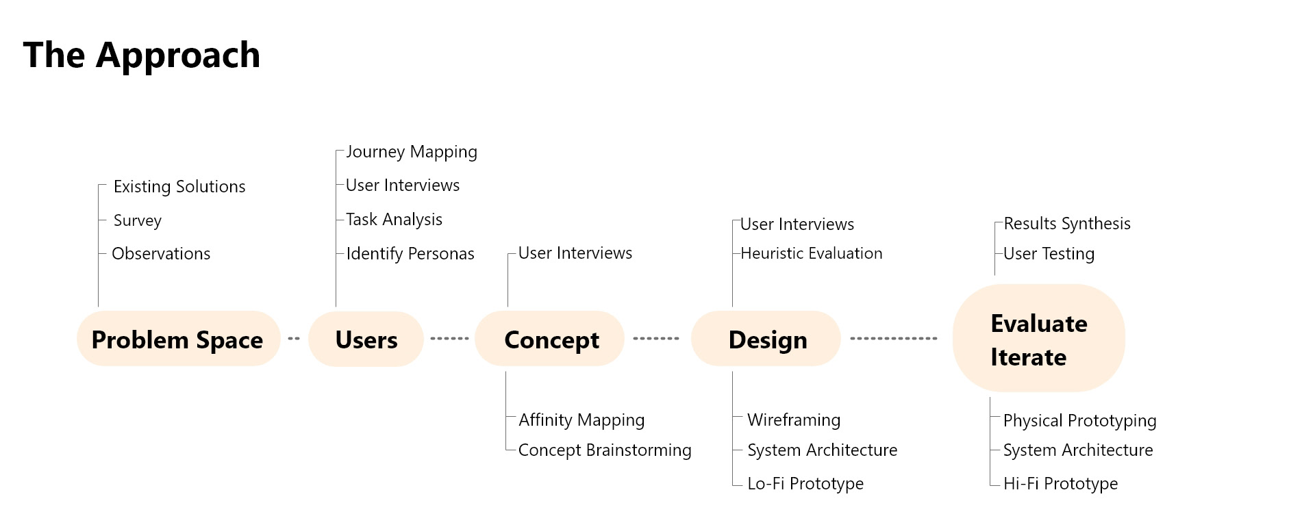
Initial Research
Observations
We initially performed 6 observations sessions across multiple Starbucks locations that each served different audiences.
It was here that we were able to begin creating the journey of the in-store experience. Some points we identified were:
Time of Day: The time of day (rush hours, meal hours) would greatly impact the state of the store and overall customer experience and wait time.
Store Location: Certain store locations (such as college campuses and dense urban areas) would experience a far busier and chaotic experience. This was elevated more so by busy hours.
Awkward Crowd Bunching: Once customers placed orders, there were no clear areas for waiting for orders, or the areas placed were not small and blocking other customers, creating disruption in the customer traffic flow.
Customer - Employee Communication: Beyond calling for names, there was no clear communication method between customers and baristas. This led to several drinks being left out until customers assumed it was for them or going to ask about their drink status. Due to the workflow of the store, a barista did not have time to continue looking for the proper customer if they did not immediately respond.


User Research
Survey and Interviews
We sent out a survey to various public forums asking general customer information and their experiences with Starbucks and received over 200 responses that we were able to take general trends from.
We interviewed frequent and infrequent customers, as well as current employees about their experiences as well. We would focus more on qualitative experiences here than with the surveys.
Some of our insights from these include:
Lack of Confidence when Ordering: Many non-regular customers are unsure of what to order from Starbucks' large menu. This results in them not exploring different options when ordering due to uncertainty in the results.
Social Pressure when Ordering: Many users we interviewed feel a social pressure to place their order as quick as possible. They do not want to add to the wait time of a line. This also results in customers not exploring other opportunities or asking baristas the questions they would like to.
Annoyance with Incorrect Names: It was an almost universal experience for customers to be given an incorrect name when placing their order. Some customers would even give a fake name that was easier to pronounce as a result. While some users felt neutral or mildly entertained about this, many felt at least some level of discomfort as a result.
Uncertainty of Wait Times: During the busier times, users were never certain of how long the wait times would be. We noticed the primary advantage of the mobile app was users placing their order 10 minutes in advance offsite. However, non-regular users did not consider or know about this in their purchasing process.
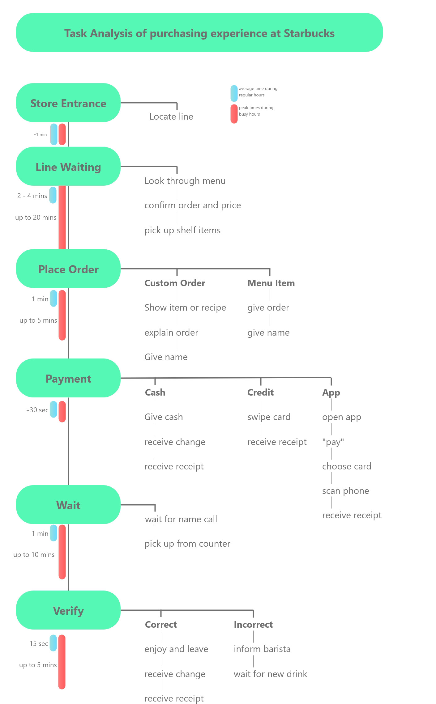
Task Analysis
From the methods above, we were able to create a task analysis and journey map of the current customer experience within the Starbucks Store
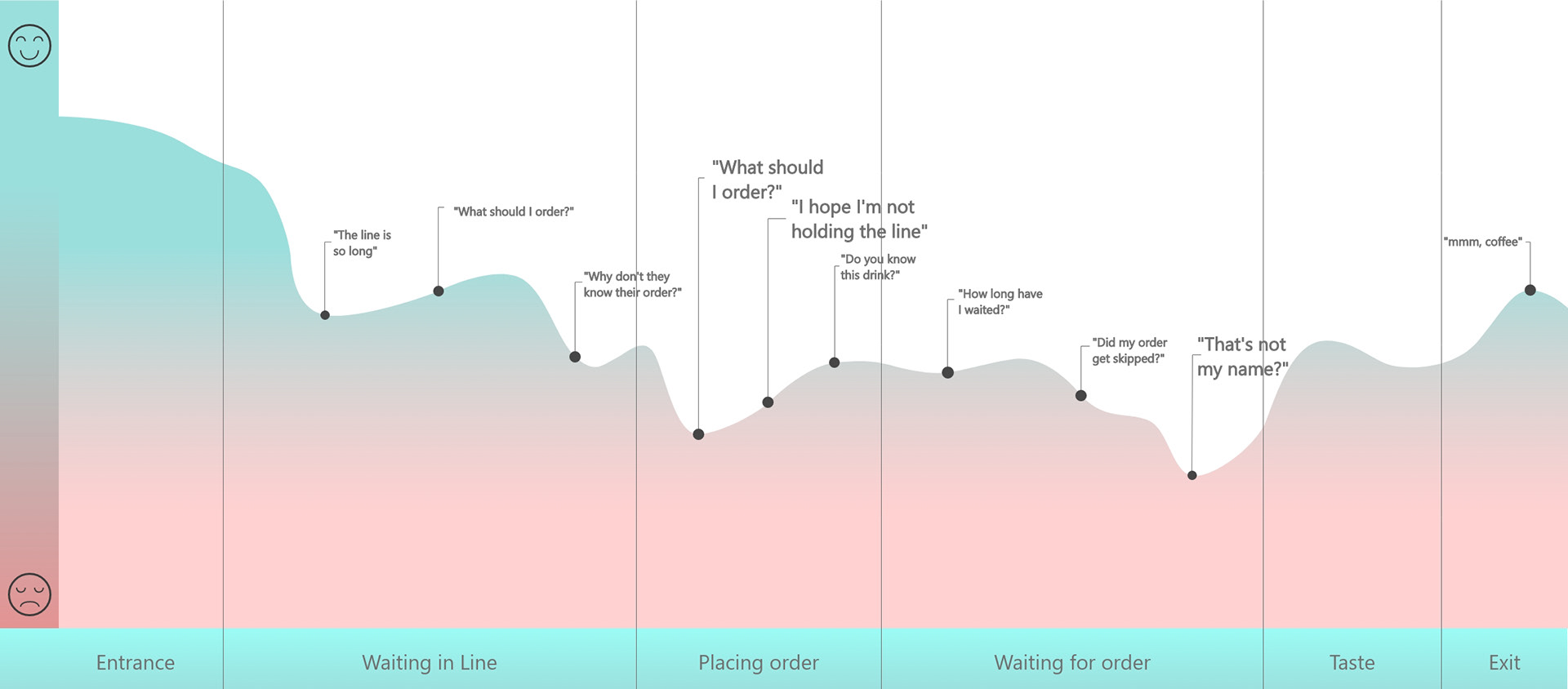
User Journeymap
From the information we gathered above, we put together a user journey map. It was using this, that we were able to identify specific points in the user journey. We noticed, the most stress from the customer would happen when after placing the order.
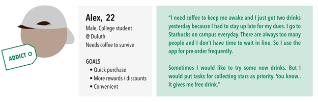
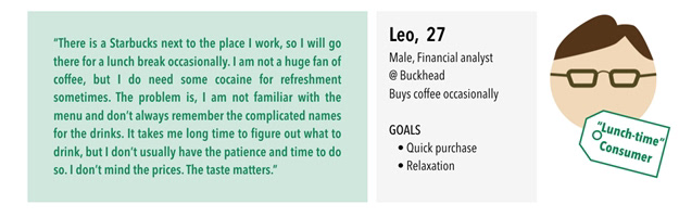
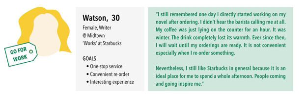
Personas
With more than enough data, we were able to create personas for our users in order to properly design for them.
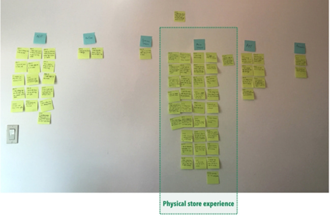
Narrow the Context
After gathering all of this data, we performed a quick affinity map with pain points we noticed in order to narrow down the best area for opportunities. Most comments towards the app involved the experience once the customer entered the store, and the vast amount of other comments were made towards the physical stores. This context is also the largest revenue source for Starbucks as a whole, encouraging us to pursue this area.
1) It should be fast and engaging.
2) It should give confidence to the user when making their order.
3) It should be informative to both new and returning customers.
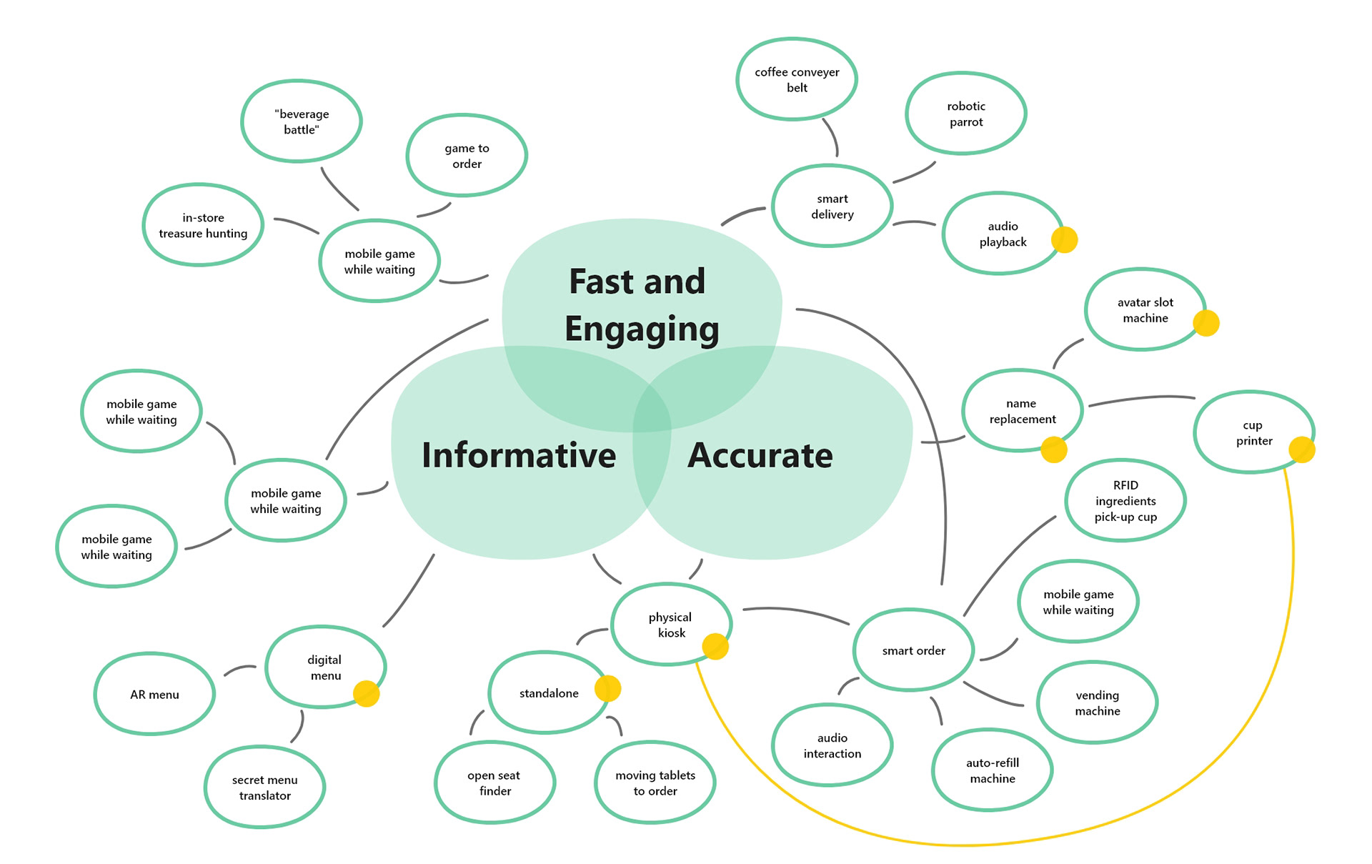
Initial Concepts
This led us to three different concepts to take back to users for feedback.
1) a kiosk printing out cups with the order and names
2) a customer avatar system
3) an audio system for customer names.
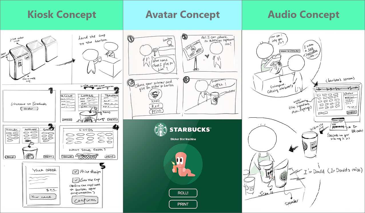
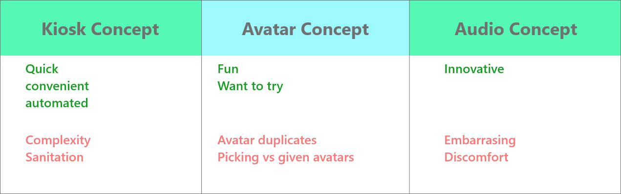
Concept Validation
We took these concepts back to customers for feedback in order to narrow them down. We interviewed 10 more users of various Starbucks' experience, gathering pros and cons of each concept. Most users had a positive response to an intervention happening within Starbucks, however, there were pros and cons with each concept that helped inform our final concept decision.
Based on this feedback, we believed that an in-store kiosk, incorporating the avatar concept had the most potential for a singular design direction.
Design Ideation
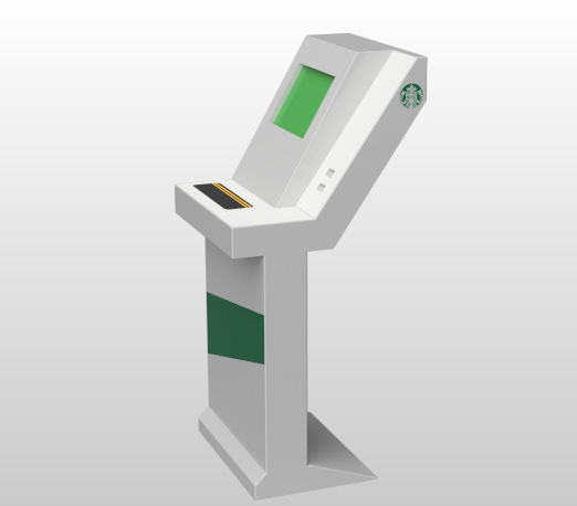
Physical Design
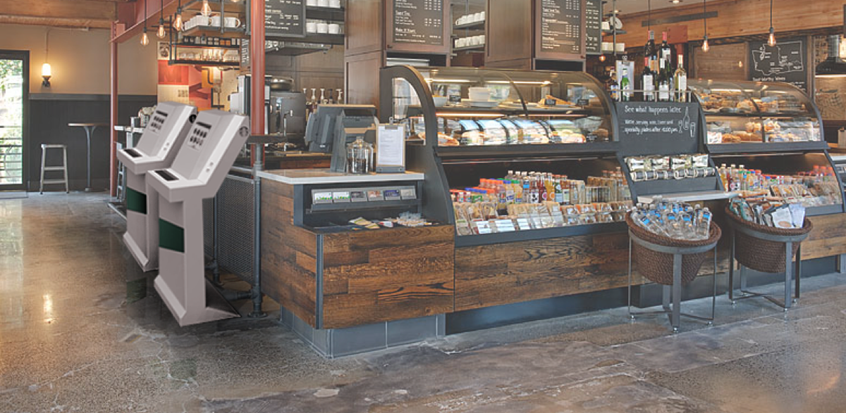
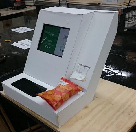
While we chose to focus on the digital interface, we knew we could achieve a higher fidelity user test including a physical element. We created a quick mock-up from plywood and foam board that an iPad could fit inside for our user testing.
Digital Sitemap
Initially we arranged the page order of what the design would achieve in order to achieve and organize the functions.
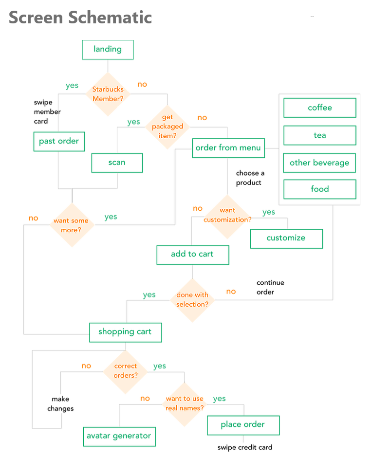
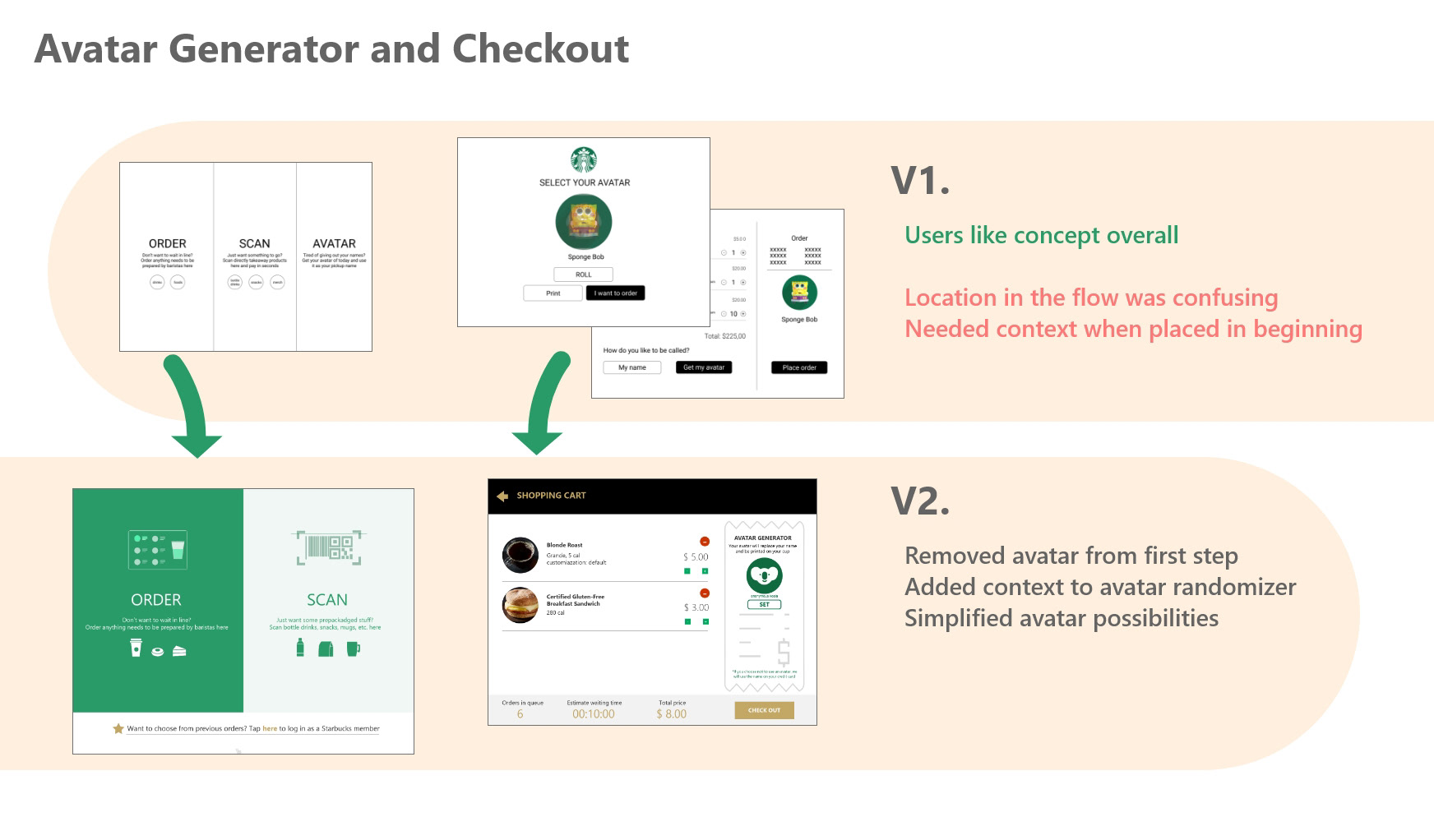
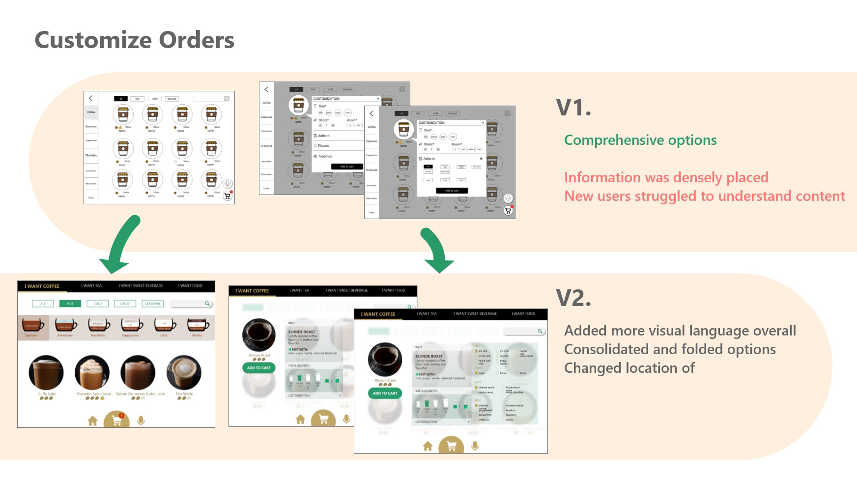
Digital Iteration v1
We created our initial wireframes using this schematic, providing functionality for the three main tasks that we would give users:
1) Order a regular drink, 2) Order a Regular Drink, and 3) Order a food item.
1) Order a regular drink, 2) Order a Regular Drink, and 3) Order a food item.
Digital Iteration v2
Between our two main phases of design, we received feedback from experts evaluating pages in a heuristic evaluations and customers navigating the pages in think loud sessions.
Final Prototype
Find our prototype here!
In our final prototype, we focused on providing functionality for users to complete two tasks, Place a specific order and Order a custom drink. We provided enough functionality in this prototype to allow users to navigate freely and make mistakes, in order to properly evaluate their process.
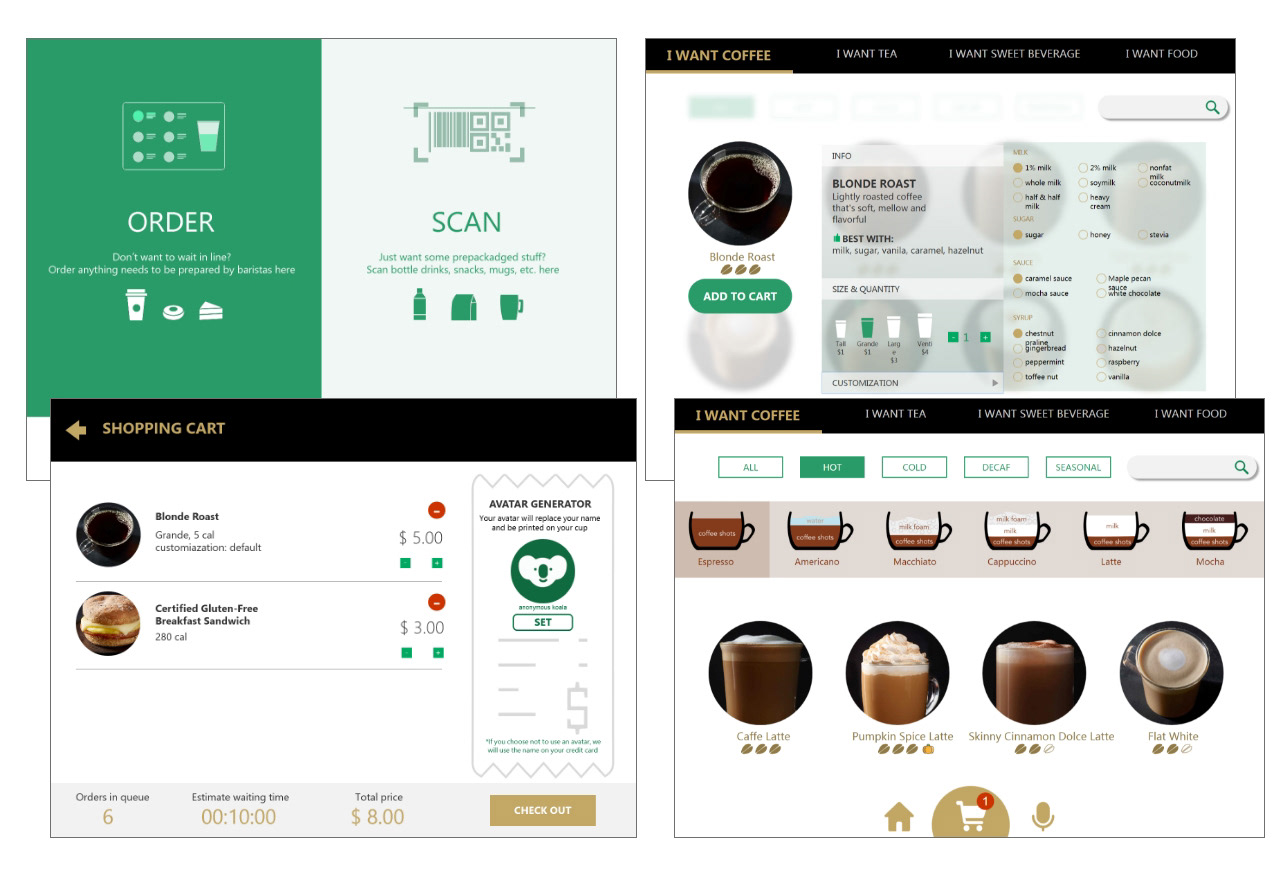
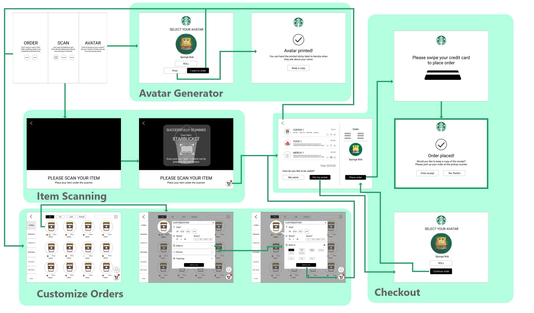
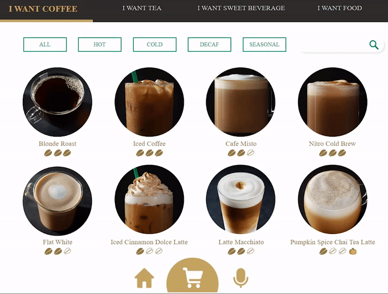
Navigating the Menu
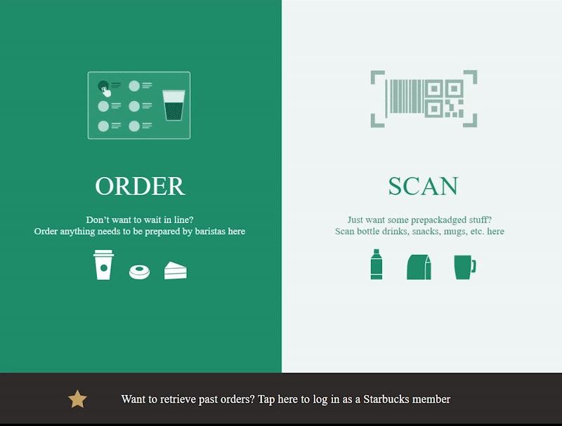
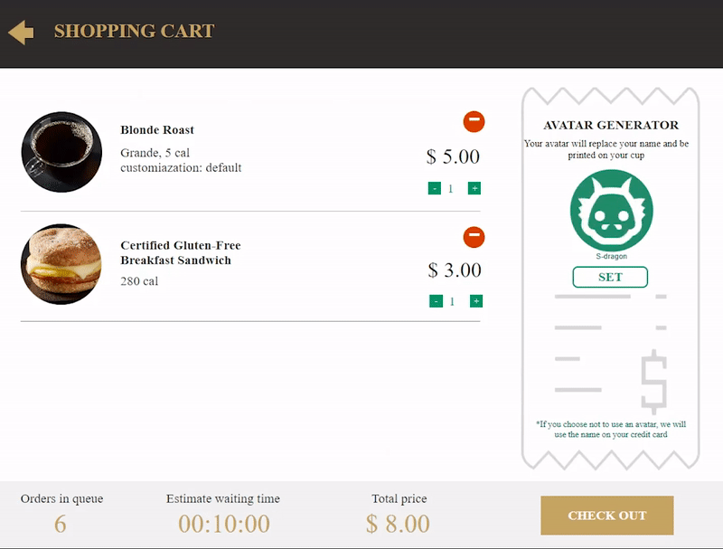
Ordering Food and Drinks
Decide Your Avatar
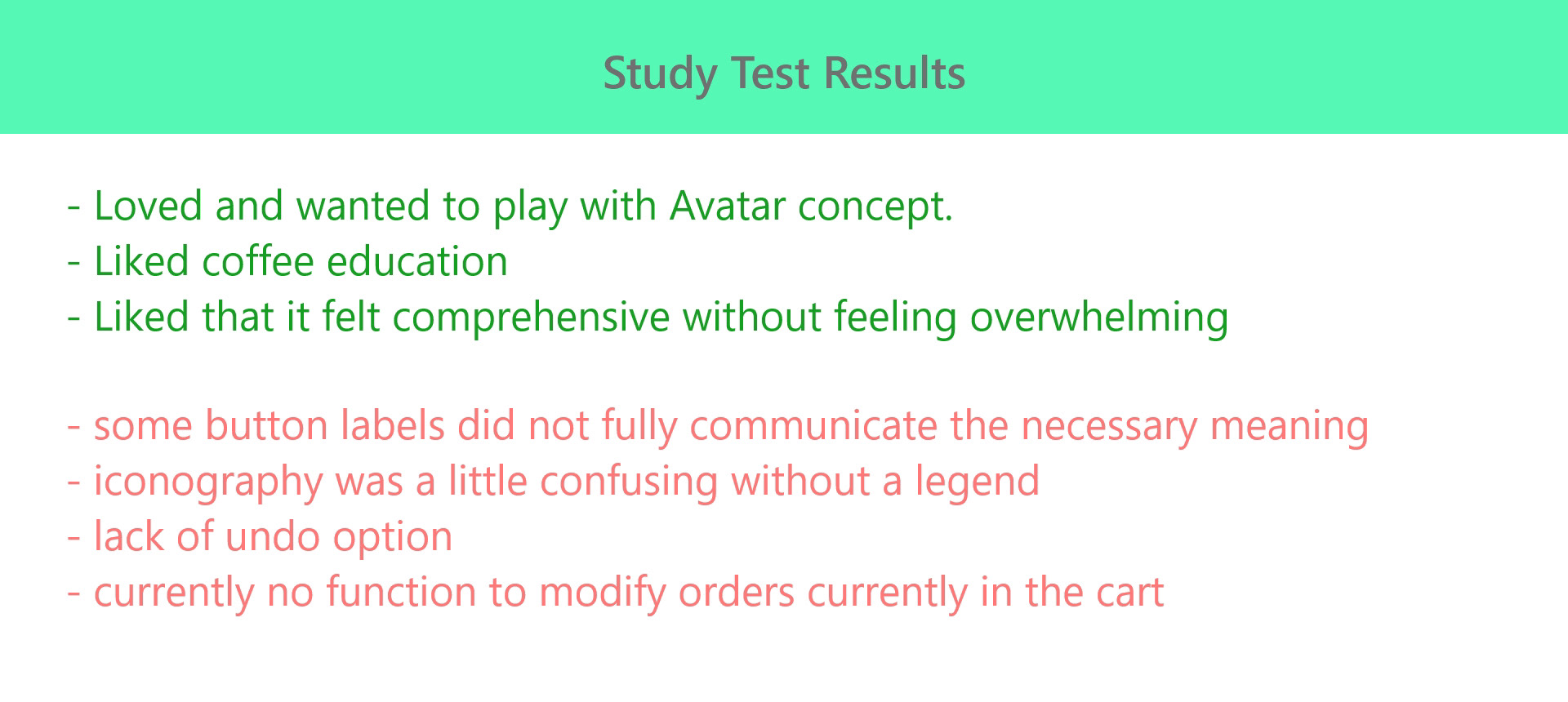
Testing and Results
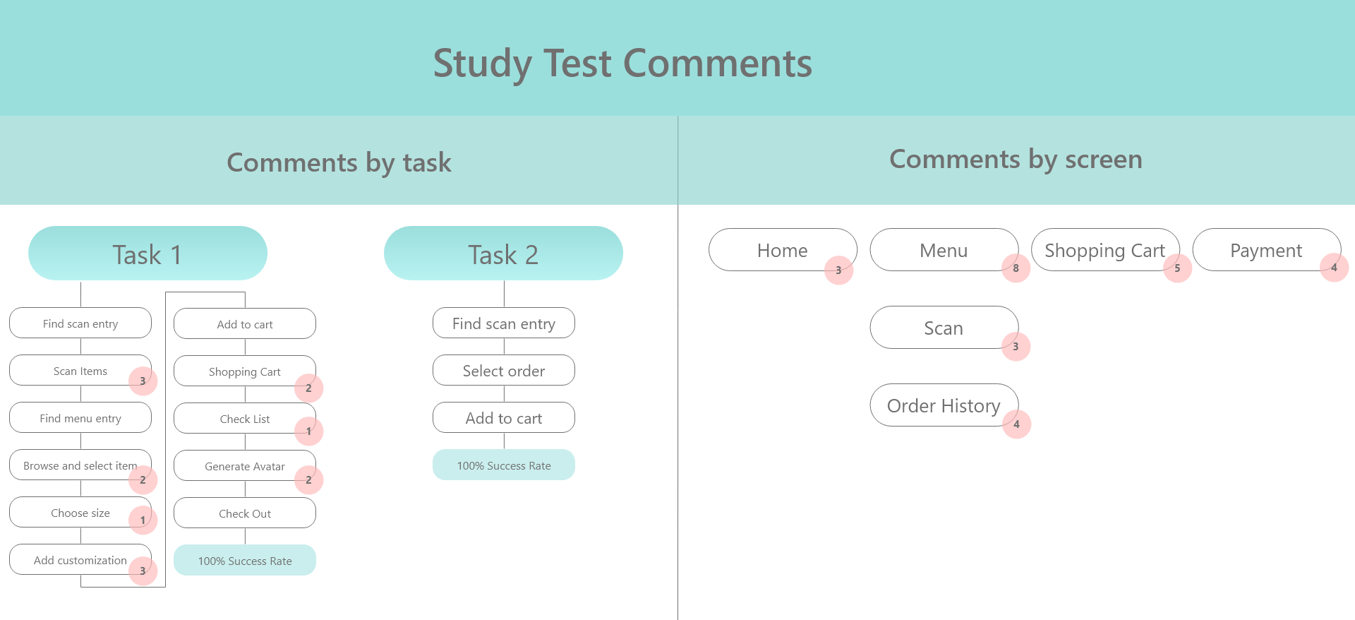
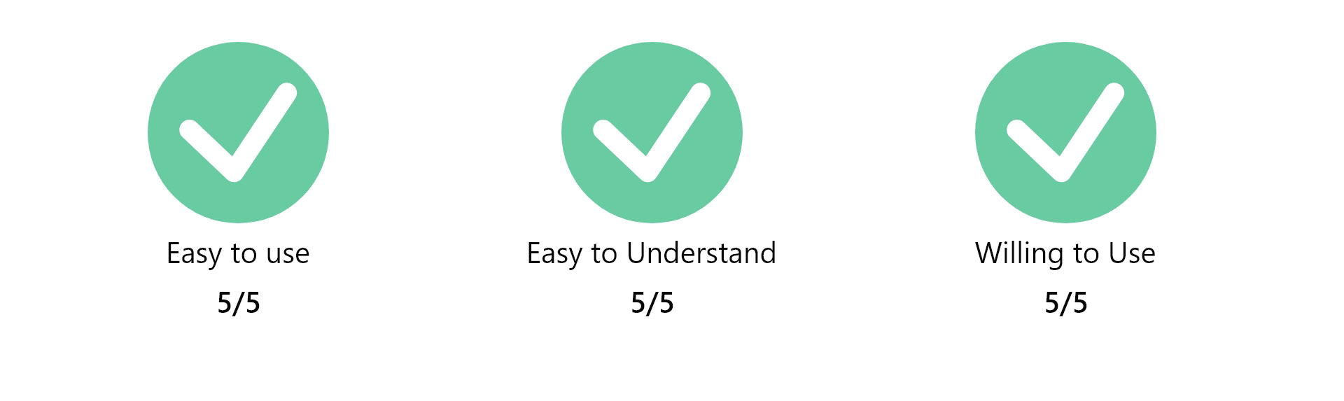
We performed 3 heuristic evaluations and 5 user benchmark tests to measure the results of this design.
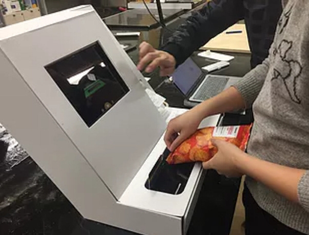
The benchmark tests were conducted using two task scenarios users were asked to complete. These task scenarios were performed at the physical model with prop products in place to create more realistic physical interactions to evaluate.
While the feedback was generally positive, we did receive notes for a few areas that could use improvement in future iterations.
Looking Back
This was my first completely research driven project, and it was a great learning opportunity for me to practice evidence based design with this. We were able to gather a large amount of data in a short time using our hybrid prototype, however, due to time constraints, we had to approach our final phase quickly that led to slightly rushed results at the end. That being said, we were still confident in the data we were able to synthesize. Our next iteration would involve taking the next design iteration into an actual storm environment with a larger user population.
Hybrid User Test Environments: One of the strengths of our design was the quick physical white model that we were able to make. This allowed our users to more easily immerse themselves in the scenario we gave them, while not being detailed enough for any user to think too much about it.
Evidence Based Design: As this was a research driven project, the strength of our outcome was the amount of user input that went into each decision. This led to a huge payoff at the end with our overall user satisfaction.
Fail and Learn Fast: We approached this project with very little to work with. It was only by trying many concepts quickly with different users were we able to narrow down concepts with concepts to our final product.