The Challenge
How might we improve the customer experience of Starbucks while not changing the product?
Our team performed a three month design study on the customer experience of Starbucks. Through data driven design choices, we created, iterated, and tested an interactive kiosk to enhance the purchasing experience. Due to IRB limitations, the claims stated here cannot be generalized to the Starbucks community as a whole.
Team: David Howard, Hanyu Gong, Shengxi Wu, Daier Yuan
Role: Physical Prototyping, Experience Design, User Experience Research
Read the full case study and design process here!
Design Ideation
Physical Design
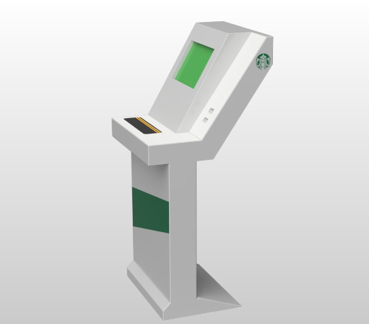
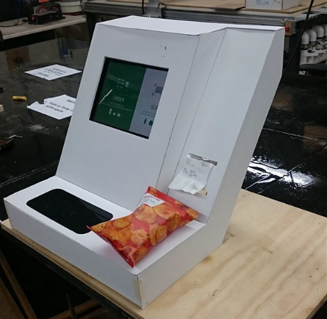
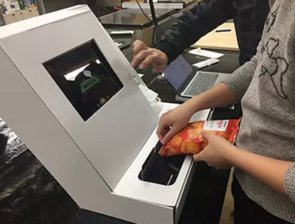
While we chose to focus on the digital interface, we knew we could achieve a higher fidelity user test including a physical element. We created a quick mock-up from plywood and foam board that an iPad could fit inside for our user testing.


Digital Sitemap
Initially we arranged the page order of what the design would achieve in order to achieve and organize the functions.
Digital Iteration v1
We created our initial wireframes using this schematic, providing functionality for the three main tasks that we would give users:
1) Order a regular drink, 2) Order a Regular Drink, and 3) Order a food item.
1) Order a regular drink, 2) Order a Regular Drink, and 3) Order a food item.
Digital Iteration v2
Between our two main phases of design, we received feedback from experts evaluating pages in a heuristic evaluations and customers navigating the pages in think loud sessions.
Final Prototype
Find our prototype here!
In our final prototype, we focused on providing functionality for users to complete two tasks, Place a specific order and Order a custom drink. We provided enough functionality in this prototype to allow users to navigate freely and make mistakes, in order to properly evaluate their process.
Navigating the Menu
Ordering Food and Drinks
Decide Your Avatar
Looking Back
This was my first completely research driven project, and it was a great learning opportunity for me to practice evidence based design with this. We were able to gather a large amount of data in a short time using our hybrid prototype, however, due to time constraints, we had to approach our final phase quickly that led to slightly rushed results at the end. That being said, we were still confident in the data we were able to synthesize. Our next iteration would involve taking the next design iteration into an actual storm environment with a larger user population.
Hybrid User Test Environments: One of the strengths of our design was the quick physical white model that we were able to make. This allowed our users to more easily immerse themselves in the scenario we gave them, while not being detailed enough for any user to think too much about it.
Evidence Based Design: As this was a research driven project, the strength of our outcome was the amount of user input that went into each decision. This led to a huge payoff at the end with our overall user satisfaction.
Fail and Learn Fast: We approached this project with very little to work with. It was only by trying many concepts quickly with different users were we able to narrow down concepts with concepts to our final product.